

{{tl-dr}}
Jira has become one of the best-known project management tools for its outstanding features and flexibility. It’s suitable for teams of any type and size (both business and Agile teams). As project teams grow and complexity increases, it becomes crucial to effectively visualize data, get insights and make informed decisions.
In this article, we examine project visualization tools and the significance of Jira visualization in project management, highlighting its role in improving reporting, monitoring progress, and driving project success.
What is Jira Visualization?
Jira visualization refers to the graphical representation of project data, statistics, and metrics within the Jira platform. It empowers project managers, team leads, and stakeholders with a comprehensive overview of project health, progress, and errors. By transforming raw data into visually appealing charts, graphs, and reports, Jira visualization simplifies the interpretation of data on complex projects and facilitates quicker and more informed decision-making.
Complex projects often create challenges for users, so a visual representation of project-related information enables effective communication between teams, analysis, and decision-making within project teams. It also helps stakeholders make wise business decisions.
Importance of Visualization in Project Management
At this point, many managers wonder, “How can I track project progress more effectively?” The answer is visualization. Here are some key reasons why visualization holds significant value in project management:
- Enhanced Reporting and Analysis: Effective project management relies heavily on accurate and timely reporting. Jira's visualization capabilities enable the creation of visually compelling reports that present project data in a concise and meaningful manner. These reports can include information such as project status, task completion rates, issue trends, and resource allocation. By visualizing such data, teams can easily identify patterns, trends that are vital for future project analysis. In fact, projects utilizing real-time data visualizations achieve a 40% increase in trend identification and a 25% reduction in analysis time costs.
- Real-Time Progress Monitoring: In dynamic project environments, monitoring project progress in real-time is crucial to ensure timely delivery and identify any deviations from the project plan. Jira visualization features provide real-time updates on project status, team performance, issue connections, and the progress of current tasks. Project managers can access intuitive dashboards and charts that offer a comprehensive view of ongoing activities, allowing them to identify bottlenecks, allocate resources effectively, and keep the project on track. Recent data indicates that teams using visual dashboards identify potential issues and risks 37% faster than those relying on text-based reporting.
- Data-Driven Decision-Making: Making informed decisions is especially important in a rapidly changing world. Visualization in Jira equips project teams with the necessary tools to analyze data and derive valuable insights. By visualizing project metrics with the help of various chart types ( Pie charts, Burndown/Burnup Charts, or Custom charts) and cumulative flow diagrams, teams gain a more profound understanding of project performance. They can then make data-driven decisions to optimize processes, mitigate risks, and drive success.
- Effective Communication and Collaboration: Clear and concise communication is vital for project success, especially when dealing with distributed teams or stakeholders with diverse backgrounds. Jira's project visualization capabilities facilitate clear communication by providing basic visualization options of project data that are easy to understand and interpret. This effective visualization serves as a common language. It allows team members and stakeholders to collaborate efficiently, align their objectives, and work towards shared project goals.
Integrated Visual Representation in Jira: Charts and Graphs
Forget about Excel-like tables. Jira, as a flexible project management tool, offers various Jira visualization tools like charts and graphs. These tools empower teams to visualize data and gain valuable insights into project execution, task completion, and user involvement across classic, Agile, and hybrid projects. These native visualization capabilities within Jira provide a solid foundation for tracking project progress. However, the available reports may vary depending on whether you use a team-managed or company-managed space.
Visualize data on Jira with built-in charts and graphs like:
- Burndown Charts
These charts showcase the progress of a sprint by displaying the remaining work against the time available. They allow project managers to track how tasks are being completed and whether the project is on track to meet the sprint goal. Burndown charts are particularly useful for Agile projects as they illustrate the ideal progress line against the actual progress, facilitating efficient sprint planning and adjustment. This report requires the Sprints feature to be enabled and is essential for predicting and avoiding scope creep.
- Burnup Charts
While similar to burndown charts, burnup charts track the total scope of the project alongside the completed work. The chart shows the "Work scope" (planned work) and "Completed work" lines. If the work scope line increases throughout the sprint, it is a clear sign of scope creep. Like burndown charts, these require the Sprints feature.
- Cumulative Flow Diagrams
These diagrams provide an overview of work in progress, work completed, and any potential bottlenecks within a project. They show how tasks move through different stages and provide insights into workflow efficiency, resource allocation, and potential areas of improvement. This report provides key metrics such as Cycle Time (time taken to move through "In Progress") and Work in Progress (WIP).
- Control Charts
They are valuable for monitoring process stability and identifying variations or anomalies in project data. They plot project metrics, such as cycle time or lead time, over time and define upper and lower control limits. Control charts help teams understand the common causes of variation and differentiate them from special causes, enabling proactive problem-solving and continuous process improvement.
- Velocity Charts
Velocity charts are commonly used in Agile project management to track team performance and estimate work capacity. They display the quantity of work the team has accomplished in each sprint or iteration, expressed in story points or work items. By visualizing the team's velocity over time, project managers can plan future sprints more accurately and adjust expectations based on historical performance.
- Jira Boards
A Jira board typically consists of a collection of a list of tasks: stories, epics, and issues, represented as cards, which are organized into different columns based on their current stage in the workflow. The columns on the board represent different statuses or stages, such as "To Do," "In Progress," "In Review," and "Done." This visual representation allows team members to see at a glance which tasks are in progress, which are completed, and which require attention.
- Jira Dashboard Extensions
They provide additional visualization widgets and gadgets that can be added to Jira dashboards. These extensions allow project teams to combine multiple visual elements, such as charts, graphs, and reports, in a single view. For example, you can add a Created vs Resolved Work Items Report to see if your backlog is growing.
Dashboards become powerful information hubs, providing a holistic overview of project performance and enabling quick access to key insights. To create one, select Create dashboard, add gadgets, and organize them using drag-and-drop. You can also customize the layout to fit your reporting needs. And share it with team members and stakeholders.
This naturally leads to the question: Jira roadmap tool with drag and drop functionality? Yes, Jira offers native roadmaps that let you schedule tasks and adjust dates using simple drag-and-drop actions.
Enhanced Visualization Capabilities with Third-Party Add-ons and Plugins
By using third-party add-ons and plugins, users can extend Jira's native visualization options and access many new possibilities. While native Jira is powerful, it often lacks a holistic resource timeline that displays the availability of all team members across multiple projects in one view. These enhancements provide teams with the ability to create visually appealing and informative planning dashboards, timesheets, and reports that cater to their specific project requirements.
With a diverse selection of add-ons and plugins available in the Atlassian Marketplace, users have the flexibility to choose the ones that best align with their project goals and visualization demands. When basic boards are no longer enough, one specific question typically arises: What are the best Jira resource management solutions? The answer lies in apps that offer a combination of visual timelines, capacity planning, and automated reporting.
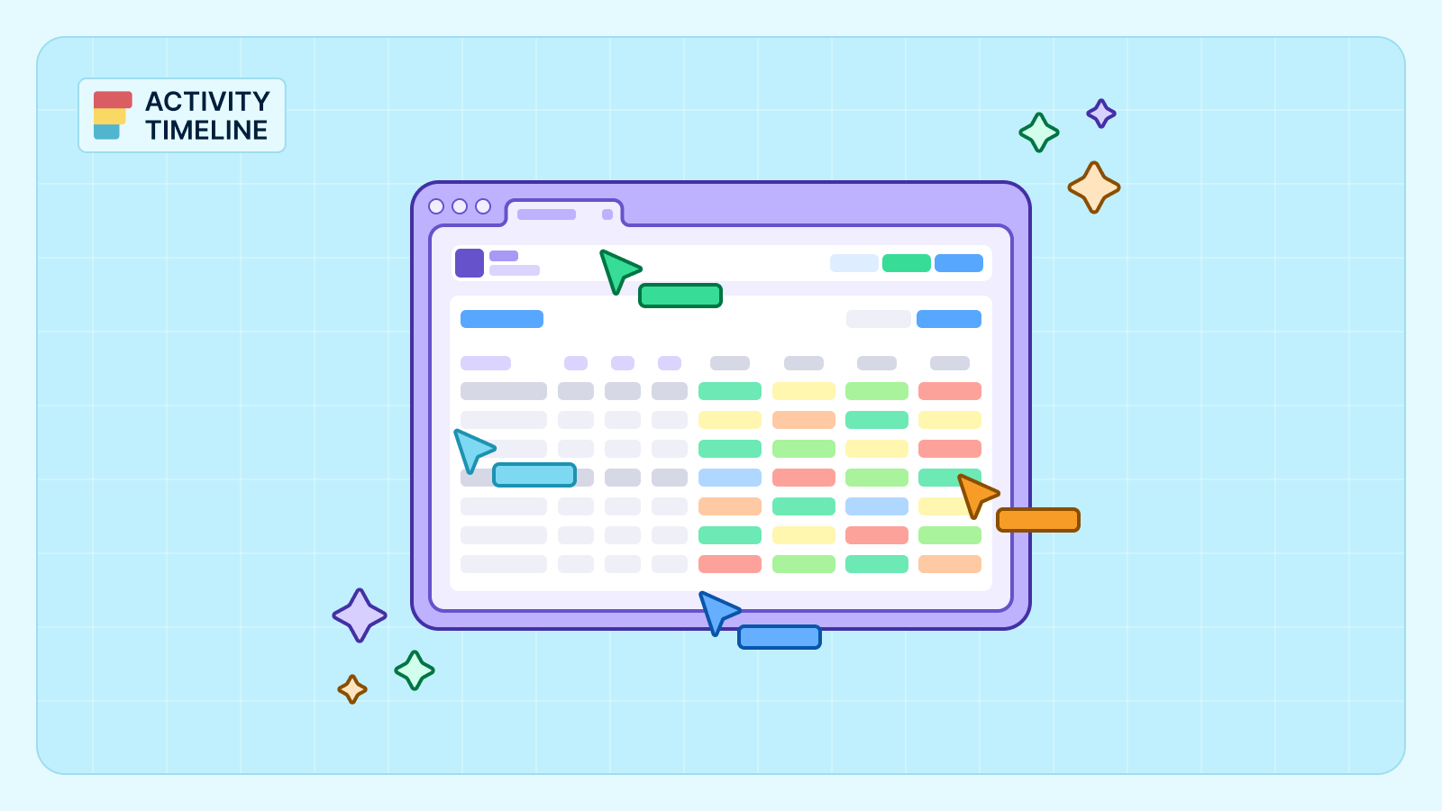
There is always a high need for advanced visualization of resources, projects & issue progress. One popular Jira app, ActivityTimeline, provides all the requirements mentioned above within a single solution. It offers specific project visualization tools: the planning dashboard with the user timelines, reports & timesheets. It's compatible with Jira Software/Jira Service Management and is an Atlassian Cloud Fortified Program participant.
Watch this video to see how to effectively visualize team capacity and workload using ActivityTimeline’s charts:
Best Practices for Visualizing Jira Reports and Projects
Visualizing Jira reports and projects effectively is crucial for gaining insights, communicating progress, and making informed decisions. Here are some best practices:
Set Clear Goals and Metrics
Begin by articulating the purpose and goals of your visualization. Determine the essential metrics, Key Performance Indicators (KPIs), or project elements you wish to emphasize. A well-defined focus will enable you to create visual representations that are both relevant and meaningful.
Optimize Visualization Selection for Data Representation
Choose suitable visualization methods that effectively depict your data and communicate your desired message. Consider various factors such as the characteristics of the data, the relationships you aim to show, and the specific audience you are targeting. Popular visualization types include bar charts, line charts, pie charts, and scatter plots.
Design for Clarity and Impact
Avoid cluttering your visualizations with excessive details or unnecessary elements. When it comes to visualizing data, the design plays a critical role in delivering information effectively. By creating visually engaging visualizations, you can maximize their impact and ensure that the intended message resonates with your audience. Use clear labels, intuitive legends, and concise titles to guide viewers and facilitate understanding.
Guidelines for Sharing and Presenting Visualized Data
Customize your visualizations to cater to the specific requirements and preferences of your target audience. Gain an understanding of their familiarity with the data and adapt the level of detail and complexity accordingly. Present information in a format that connects with the viewers, facilitating their comprehension of key insights.
Maintain Data Integrity
A visualization is only as good as the data behind it. Ensure that team members update Jira statuses and estimates regularly. Accurate and timely data entry is essential for keeping reports reliable. This prevents misleading conclusions and keeps everyone aligned.
Tools to Use for Jira Visualizing Projects at Every Stage
Teams can achieve a comprehensive understanding of project progress, pinpoint bottlenecks, and monitor essential metrics by utilizing appropriate Jira visualization tools. Consider these essential techniques to use for visualizing projects at every stage in Jira:
Stage 1: Mind Mapping for Project Initiation
Mind mapping is a valuable method for generating ideas, capturing project requirements, and structuring thoughts in the initial phase of a project. By visually organizing project components, teams can establish a solid foundation for the project and foster alignment among all involved parties.
Stage 2: Use Dashboards and Timelines for Planning
Combining dashboards and timelines provides a visually rich view of project planning. These dashboards offer an overview of project performance and important metrics, while timelines display the duration, dependencies, and critical milestones of project tasks. This combination helps stakeholders gain a holistic understanding of project progress and aids in effective decision-making. Integration with third-party plugins like ActivityTimeline further improves visualization in Jira.
Stage 3: Monitor Progress in Jira
Monitoring project progress is crucial to ensure timely delivery and identify any deviations from the original plan. Jira offers various features for progress monitoring, such as issue tracking, status updates, and notifications. Teams can use Jira's built-in reporting features, like dashboards and agile reports, to gain real-time data into task completion, burn-down charts, velocity, and team performance. Visual alerts like "traffic light" indicators (Red, Yellow, Green) can update automatically based on worklog data. This helps managers identify risks at a glance without manually reviewing every report.
Stage 4: Track Time with Timesheets
Tracking time accurately is crucial for project management as it allows teams to monitor resource allocation, measure productivity, and ensure timely delivery of tasks. In Jira, the integration of timesheet tools provides a convenient way to record and analyze time spent on different project activities. Timesheets offer comprehensive insights into how time is allocated across tasks, enabling project managers to identify areas where resources are being underutilized or overburdened. Project managers can access consolidated timesheet reports that display individual and team-level time entries, facilitating accurate invoicing, client billing, and financial analysis.
Stage 5: Use Advanced Reports
Custom charts play a significant role in project reporting, providing visual representations of key project metrics and KPIs. Plugins like eazyBI, Charting for Jira, or Power Scripts enable the creation of custom charts and Jira data analytics reports. Teams can generate bar charts, pie charts, line graphs, or other visualizations based on specific project data extracted from Jira. Many advanced tools also allow you to export these visualizations or share them through external links. This ensures that stakeholders who do not have Jira access can still stay informed about project health.
Examples of Jira Visualization in Action
Visualization is crucial for organizations and teams of any type and size. Let's take a look at several visualization scenarios for different industries and highlight the best examples of Jira visualization features.
Practical Showcases of Jira Data Visualization in Real-World Contexts
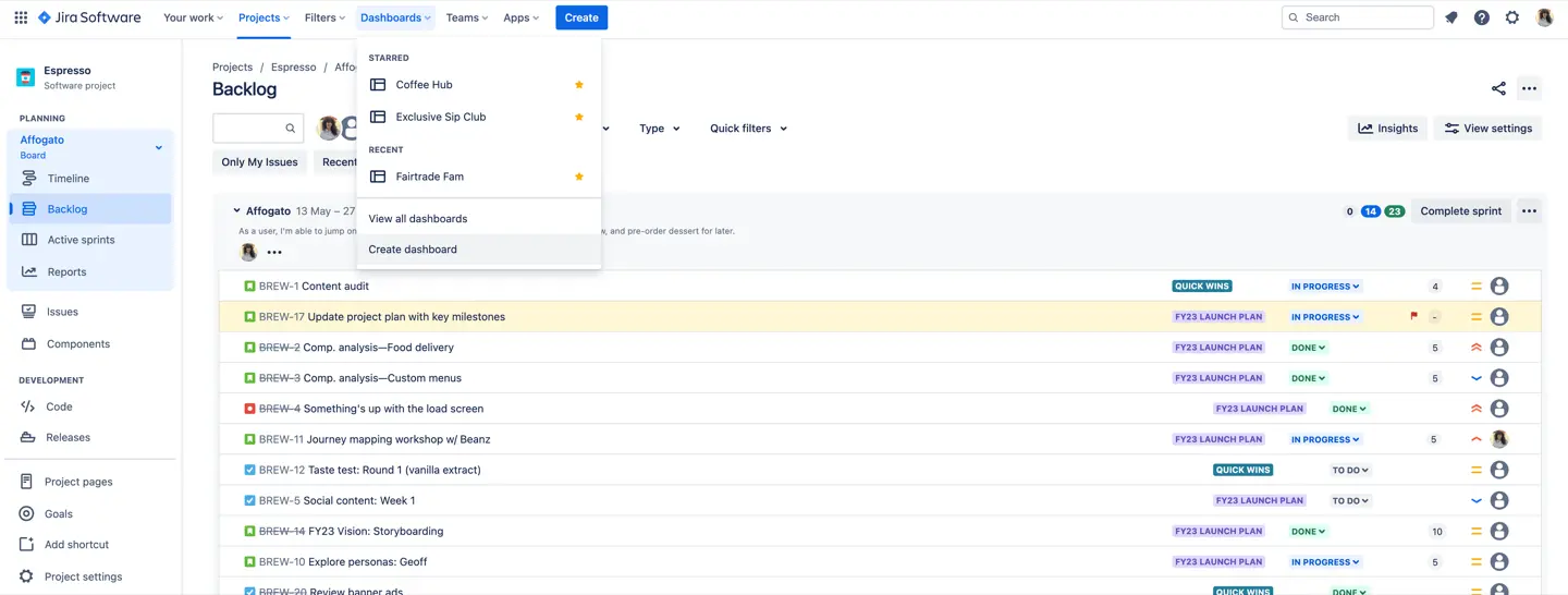
As we have previously mentioned, Jira users often choose Jira Boards, Reports, and Dashboards to visualize their workflows.
The board's columns portray distinct statuses or stages, including "To Do," "In Progress," "In Review," and "Done." This visual depiction enables team members to swiftly identify ongoing tasks, completed ones, and those needing attention with a single glance.
To enhance visibility, you can use Swimlanes to group tasks by Assignees, Epics, or Subtasks. Additionally, Custom Filters powered by JQL allow you to focus on specific issues.
In team-managed projects, you currently cannot create additional boards, whereas company-managed projects allow for multiple boards and cross-project views.
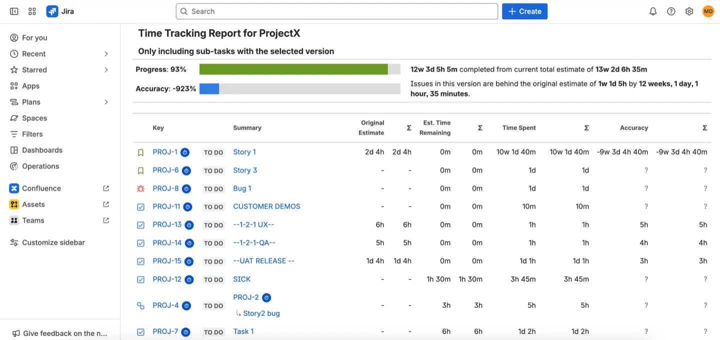
Reports provide more specific data visualization depending on your needs. Jira offers various agile, issue-tracking, and management reports. Project Managers often use Time Tracking and User Workload reports to ensure that tasks are assigned accordingly and to monitor and analyze the time spent on tasks or issues. These reports assist in tracking individual or team productivity, identifying time-consuming activities, and optimizing resource allocation.
Note that these specific reports are available only if your Jira administrator has enabled time tracking. Some reports, such as the Time Tracking Report, have a display limit of 1,000 work items and 1,000 sub-tasks.
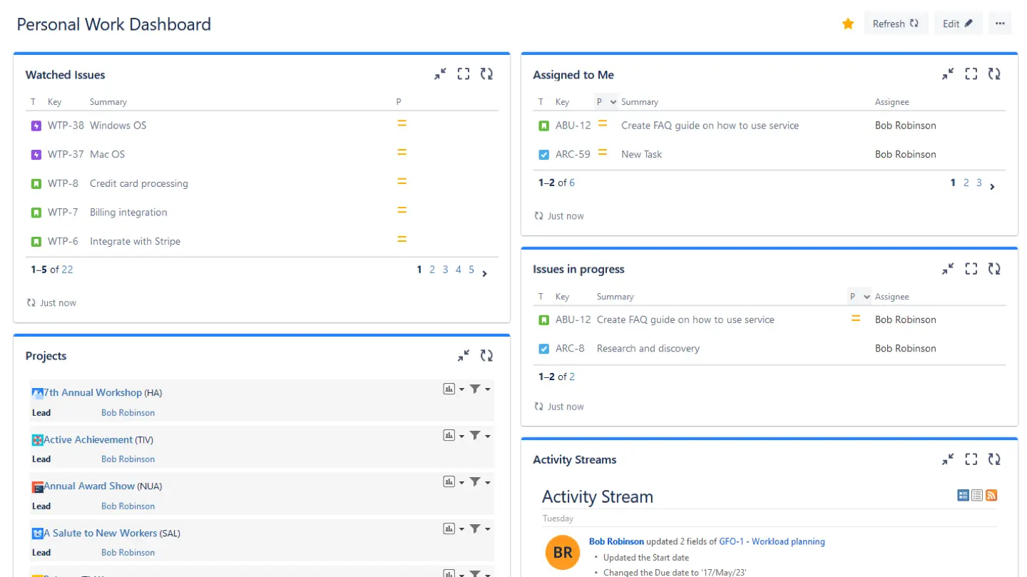
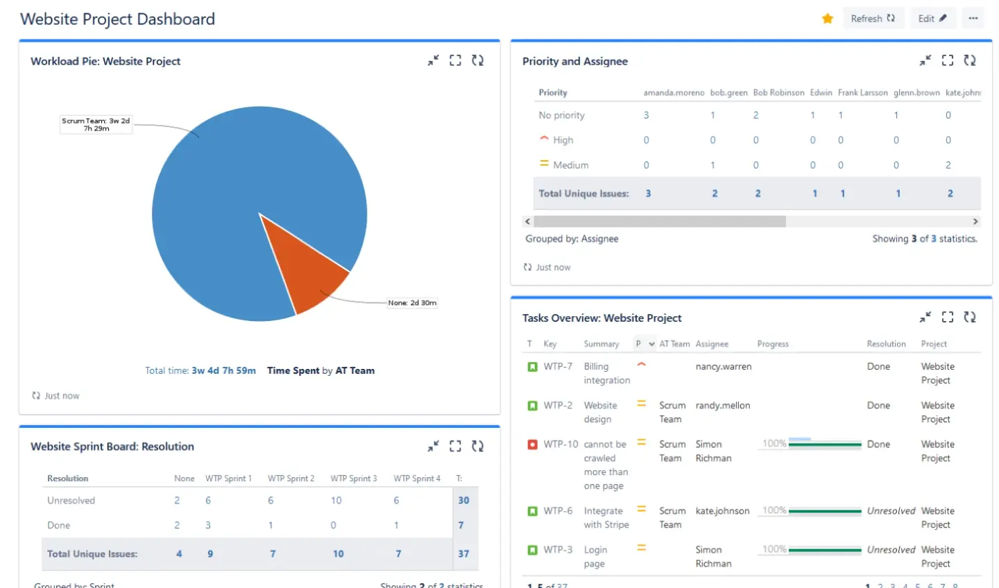
Jira Dashboards are great visualization tools, as you can configure gadgets specifically for your needs. It's very comfortable to track individual activities with the help of a Personal dashboard:
Or make a dashboard to track the specific project and get detailed Jira issue visualization :
Don't hesitate to use powerful features presented in Jira third-party plugins. The combination of Jira and add-ons makes project planning advanced and saves precious time. This often leads to the question: How to gain better visibility into my project portfolio performance? The most effective method is using cross-project dashboards and resource management apps like ActivityTimeline. These tools combine data from multiple teams into a single, high-level timeline, giving you a clear view of your entire portfolio.
Scenarios for Employing Visualization Across Diverse Industries
ActivityTimeline provides users with 4 visualization modules: a planning dashboard with all Jira tasks/projects in one place and users' activities (on both individual and team levels), a personal workspace for individual activities, reports, and timesheets. All data is fully synchronized with Jira, and vice versa.
Let's take an example of a software development team.
With the Planning Dashboard, we can see a team and its tasks on individual timelines. You will find workload indicators that follow a simple color logic: Green for optimal load, Yellow for underload, and Red for overload.
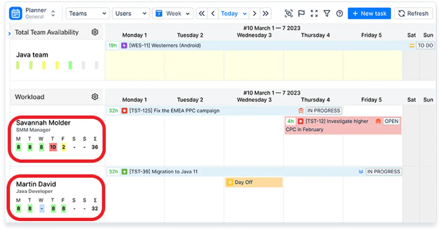
The app also provides internal events like vacations, sick leaves, etc., and they are all counted as non-working days and reflected on the dashboard accordingly, which is very comfortable when you want to receive a clear resource availability/workload picture.
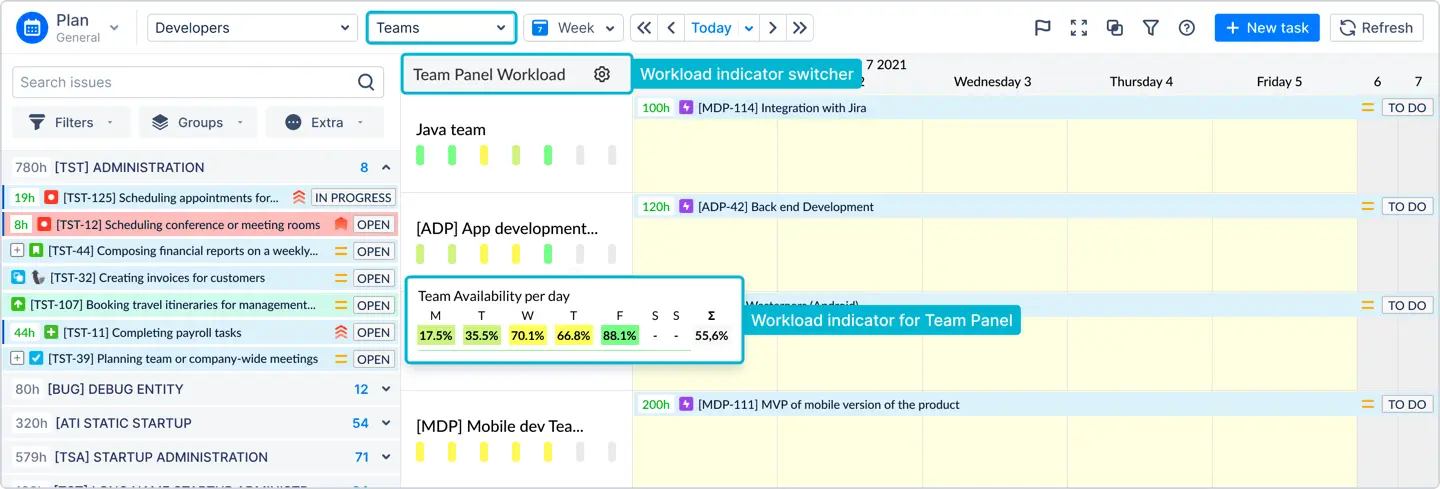
Here we can also see a separate team field for the whole team and tasks assigned team. Workload indicators are also presented on the team panel. Agile teams that need program visualization in Jira can use this feature to separate individual tasks and overall project teamwork (epics, stories, and program increments) or when you need to plan the workflow for multiple teams at a time.
For instance, Sirius Technologies improved its visibility by moving from Kanban boards to this structured planning approach. They now require teams to pre-plan workloads a week in advance to identify tasks at risk of delay early. This proactive strategy allows managers to understand the impact of moving resources before any blockers occur.
The Personal Cabinet in ActivityTimeline is a perfect visualization of individual work. Here users may find only their personal tasks and projects here. Let's look at how a member of a business consultancy team, Bob, can plan his time.
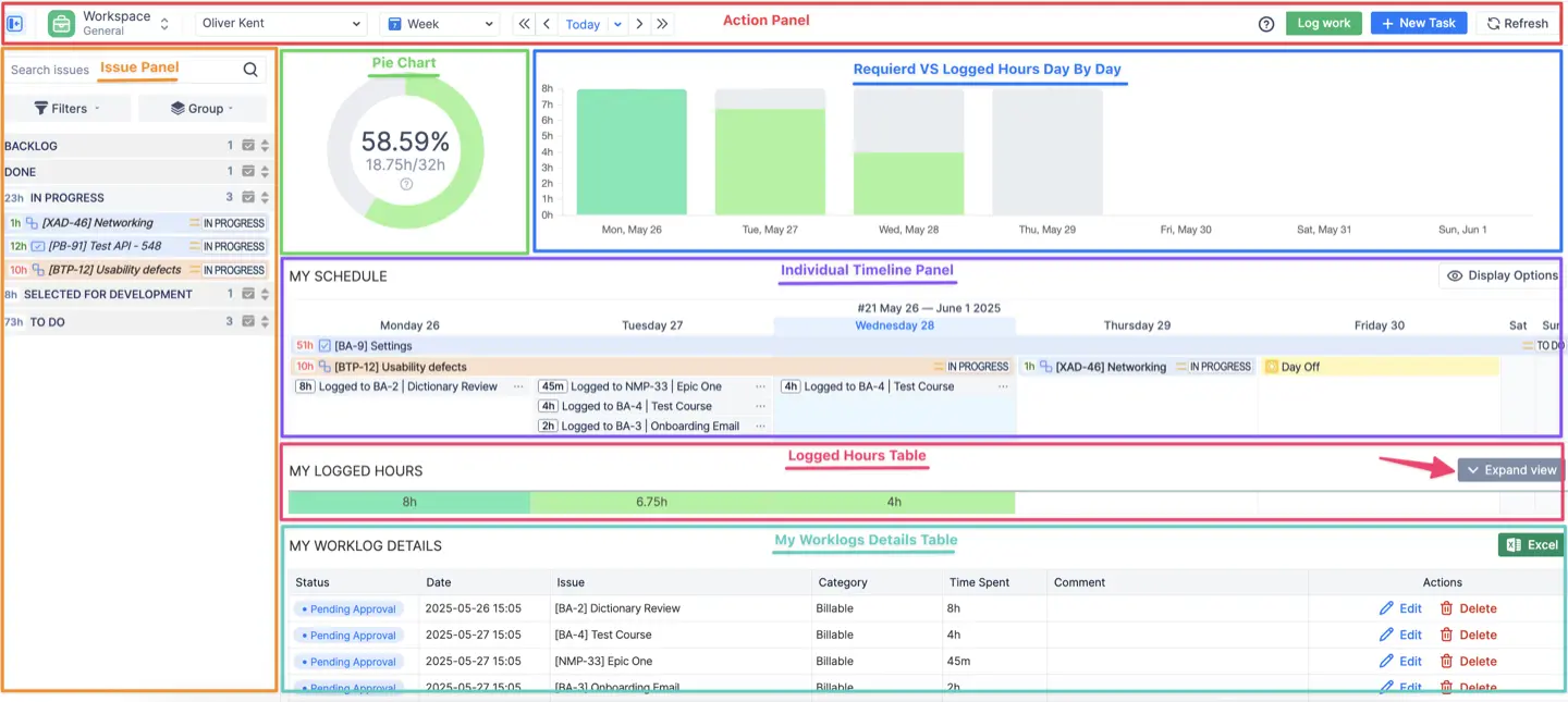
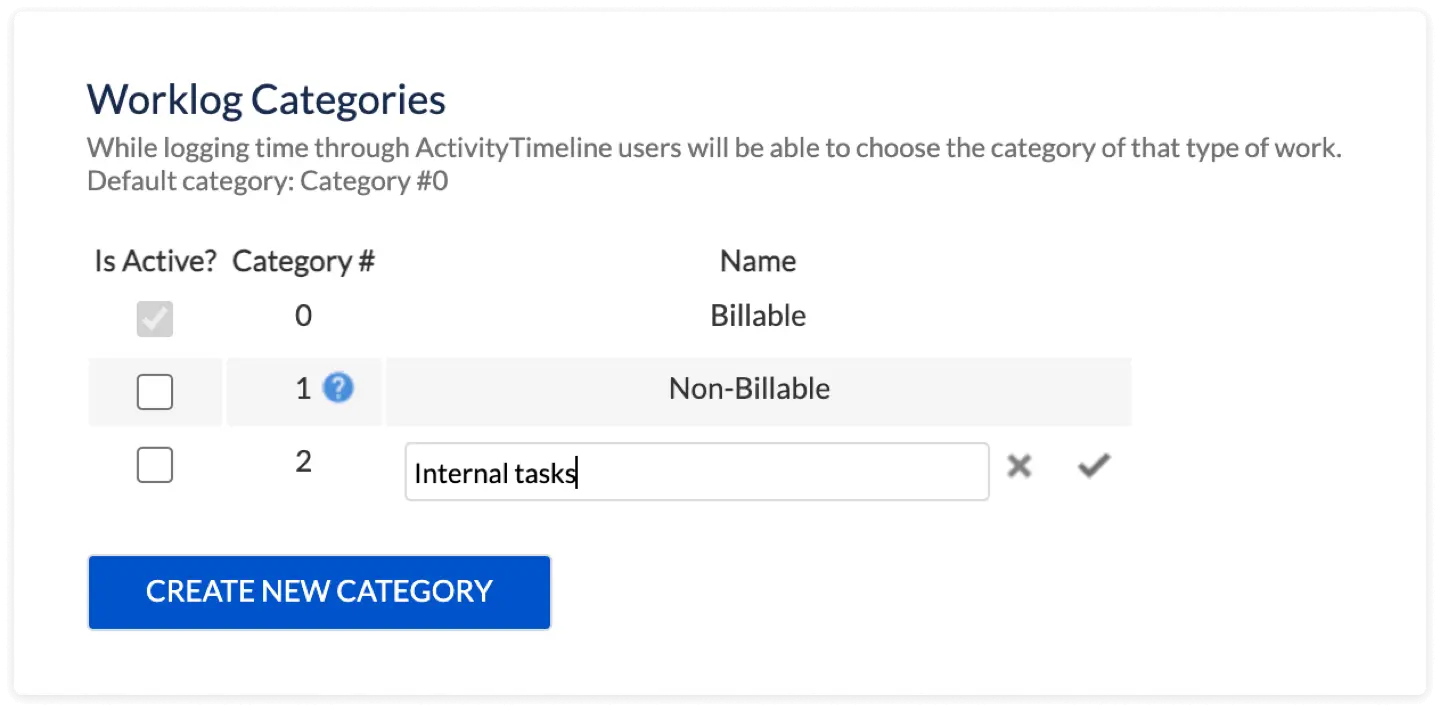
This module gives the user a picture of his tasks and projects, as well as a personal calendar view of tasks. Here we can find special visualization charts (like Pie and Bar charts) where the user can understand their workload and availability through the chosen period of time. Since the app provides internal events, Bob can make bookings for future meetings or trips. These can be automatically converted into worklog, allowing him to skip manual data entry for activities not connected to Jira. Bob can log worked hours (billable and non-billable to his choice) from the personal workspace and observe the logged hours directly in the same place.
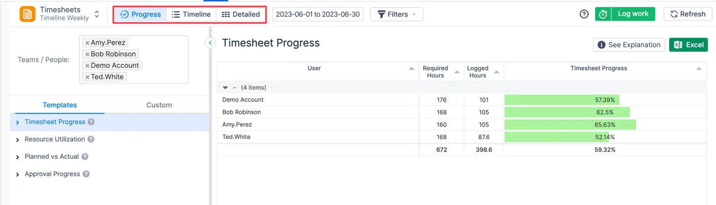
The Timesheet module is a great way to get an understanding of time spent on tasks and projects by users. With ActivityTimeline Team Timesheets you can see where users spent their time in a few clicks. You can even switch between Timeline, Detailed, or Progress views to get different Types of Timesheet Reports:
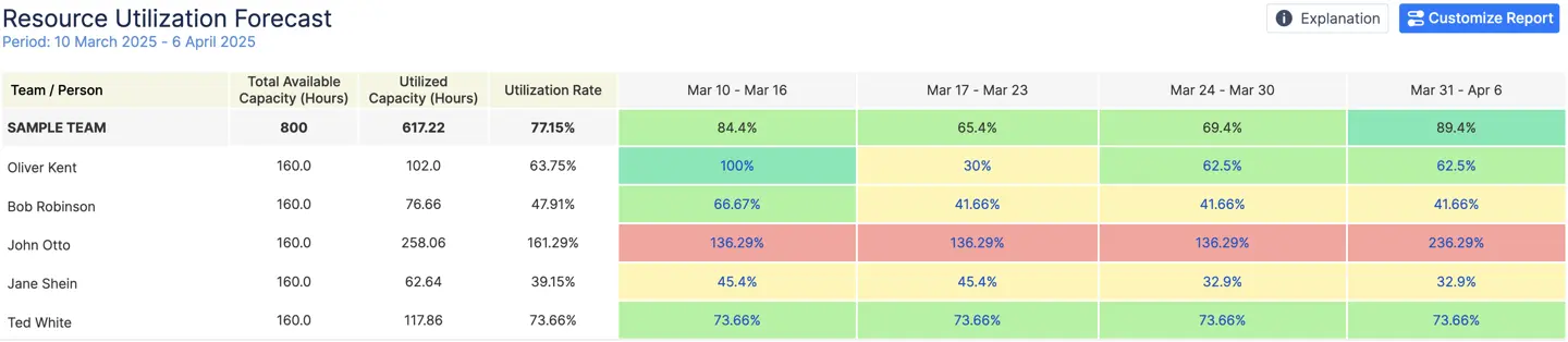
The Report Module offers a system to generate reports on resource utilization and project progress. These reports provide valuable insights into the allocation of resources and help identify areas where resources may be over or underutilized. By analyzing this data, teams can make informed adjustments and optimize resource allocation for improved project efficiency and productivity.
For example, the Resource Utilization Forecast shows the actual resource workload within the chosen scope. This helps managers distribute the workload evenly among the team members.
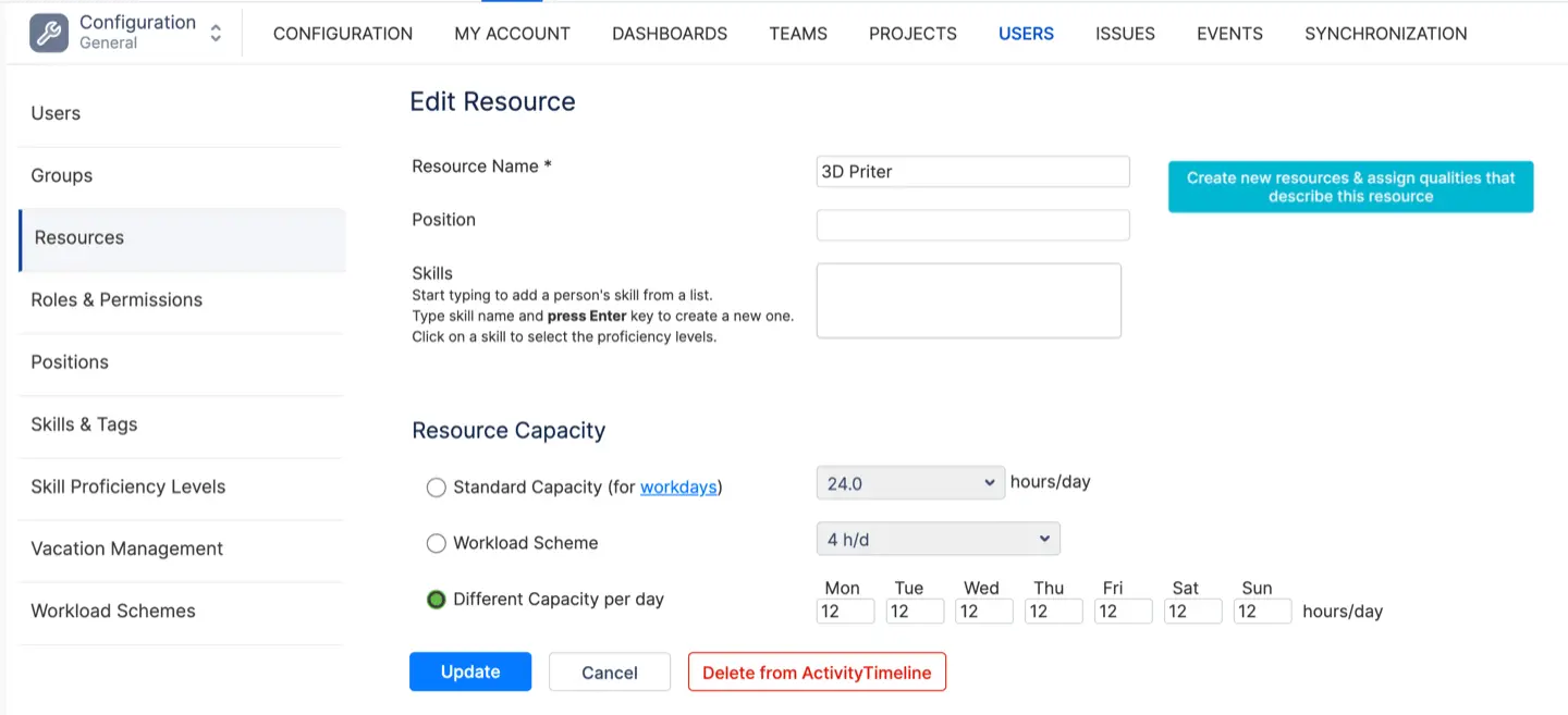
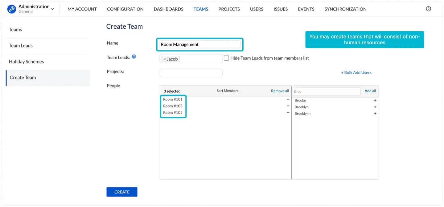
Jira is widely known as a project, issue, and team management software, but it doesn't manage non-human resources. You can manage non-human resources with the help of third-party add-ons, like ActivityTimeline which will supplement your visualization needs accordingly. By setting up Non-Jira User profiles, managers can assign capacity to tools or rooms and plan their use on the timeline just like they do for team members.
Conclusion
Jira offers a powerful platform for visualizing reports and managing projects effectively. By leveraging its built-in features and integrating third-party add-ons and plugins for Jira data analytics, teams can unlock the full potential of its visualization capabilities. From the early stages of project initiation and planning to task execution, progress monitoring, and project reporting, Jira provides a comprehensive suite of tools to visualize data and drive project success.


