
Staying on top of your team's progress is essential for successful resource management and project delivery. One of the most effective ways to achieve this is using a Jira planned vs. actual chart. This powerful report allows you to compare your initial project plans with the real work completed, offering valuable insights into your project's trajectory.
In this guide, we will walk you through the steps to create a Planned vs. Actual chart, empowering you to monitor your project's performance effectively.
Custom Charts and Reports in Jira
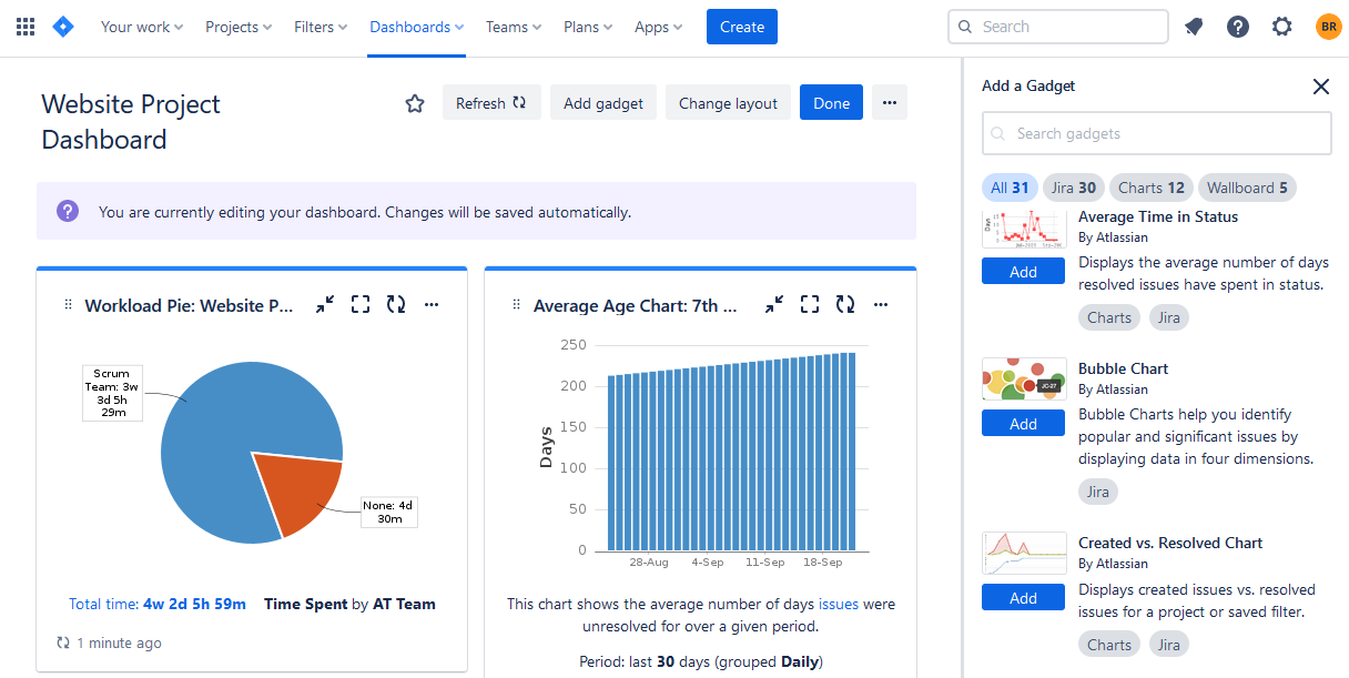
You can choose from different reports and custom charts of various types to select: bar, line, pie, etc. Some of them can be created in the Jira Reports section. Just choose the values and generate them in a few clicks:

But most of them are presented in Jira Dashboard Gadgets.
To get more custom charts you can try add-ons presented in the Atlassian Marketplace, available for Jira Service Management and Jira Software. For example, ActivityTimeline is a resource planning and tracking tool and a Platinum Marketplace Partner. This add-on helps to manage teams and projects and provides advanced reports and charts like Actual vs. Planned and more.
{{rich-cta-3}}
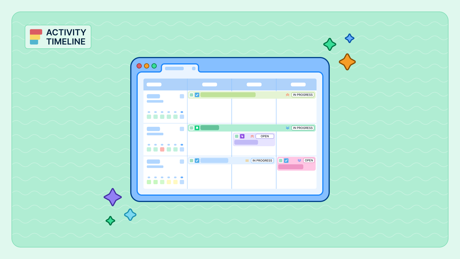
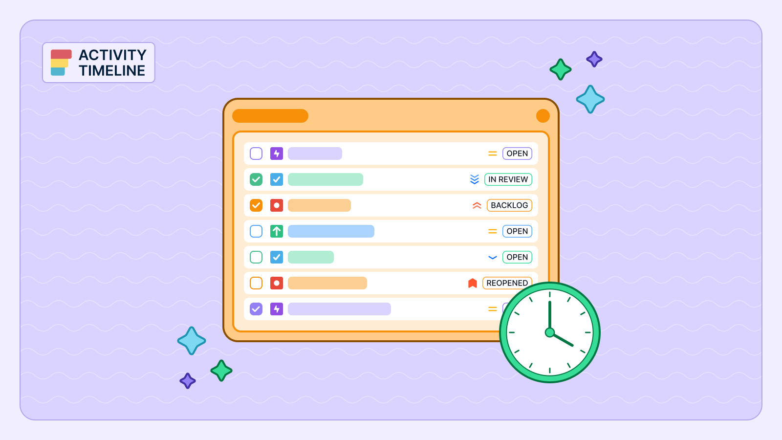
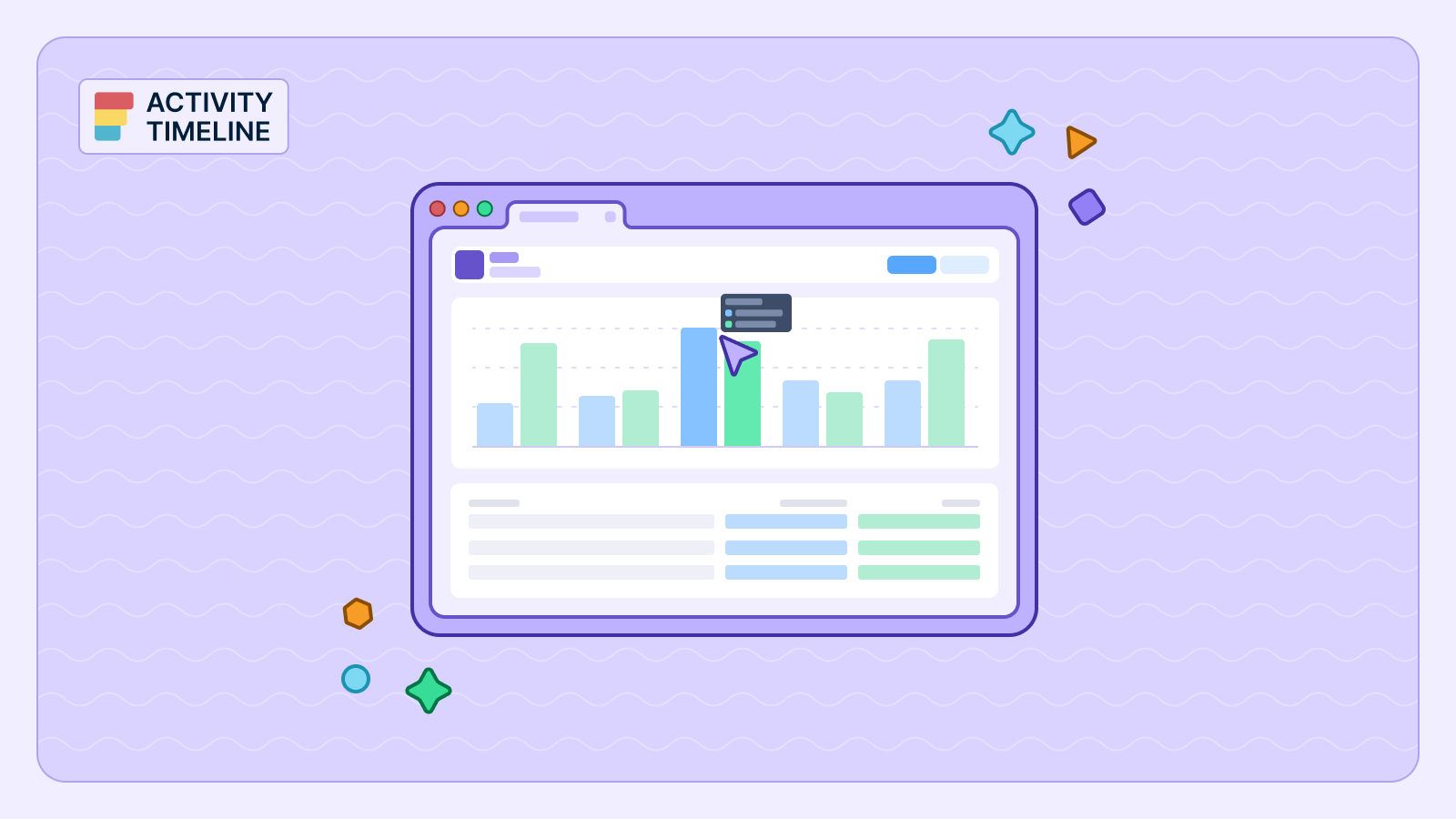
Jira Planned vs. Actual Chart in ActivityTimeline
ActivityTimeline app offers numerous resource and project reports/charts for your advanced resource planning and project management:

One of the most popular charts in the app is Planned vs. Actual. Its value cannot be overestimated as it provides an important snapshot of a team's performance during a specific period. Its purpose is to equip team leaders and managers with the capability to compare the original estimates of planned tasks and the actual amount of time used to complete the tasks. All data is auto propagated and up to date.
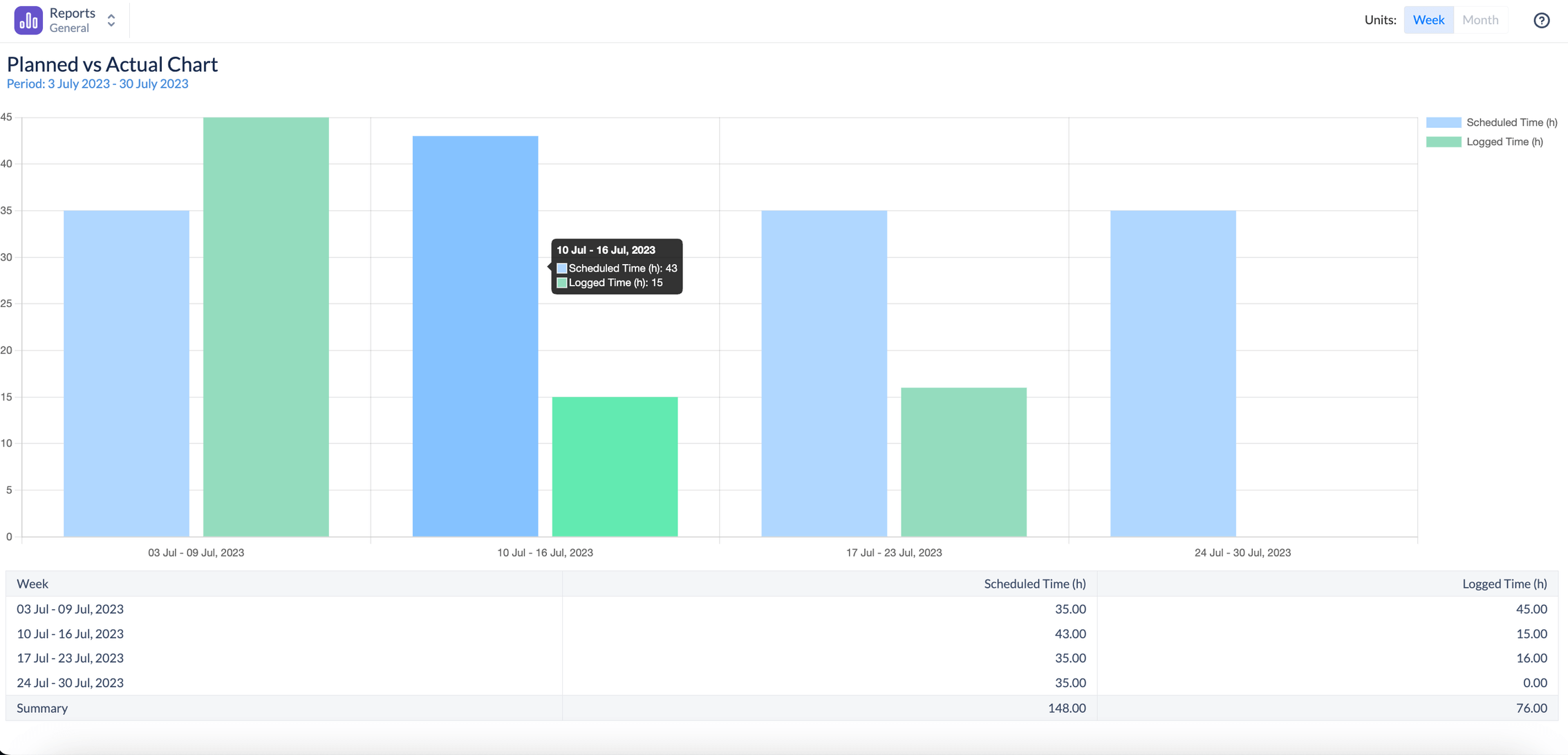
Chart Key Components
For a better understanding of the chart, let’s take a look at its main components:

1. Scheduled Time
This one represents the amount of work that was scheduled for the team across various projects. This is based on the Original estimate of issues, ActivityTimeline Bookings & Placeholders.
2. Logged Time
Depicts the hours that were actually worked by the team, giving a real-world picture of the team's output based on time submitted through Log Work dialogue (either in Jira or in ActivityTimeline).
Chart Explanation
It is visible on the screenshot, that on that specific week, the team underestimated how much time they’ll need to complete the planned work, and it took them significantly more time to complete their tasks:

As we can see from it, for week 26 Jun - 02 Jul 2023 we planned to spend only around 23 hours per project, but instead, we spent over 40 hours, which means the initial estimate was incorrect and we are behind the schedule.
Conclusion
Creating a Jira Planned vs. Actual chart is a powerful way to monitor your project's progress, identify deviations from your initial plan, and take proactive measures to ensure success. With the support of the right planning reporting tools, like ActivityTimeline, you'll be better equipped to manage projects effectively and deliver results that meet or exceed expectations.
{{rich-cta-5}}