Atlassian products, one of which is the widely acclaimed project management tool, offer advanced features that can streamline your workflow. Explore the advanced charts to help you analyze and track team performance. Among these, the Team Utilization Pie Chart stands out as a powerful visualization tool.
In this article, we will explore advanced charts with a specific focus on the Team Utilization Pie Chart.
Jira Charts: How to Create?
Charts provide valuable insights to project managers, enabling them to make data-driven decisions. Jira charts are not just eye candy. They offer several key benefits, including:
Enhanced Data Interpretation: These charts make complex data more digestible, helping teams and stakeholders understand project progress.
Real-Time Insights: With dynamic updates, you can keep your finger on the pulse of your project without the need for constant manual data entry.
Customization: Tailor your charts to your specific needs, ensuring they present the right information in the right way.
Efficient Decision-Making: These charts help project managers and teams make informed decisions quickly.
There are several ways of creating charts:
Generate Charts with Reporting Section
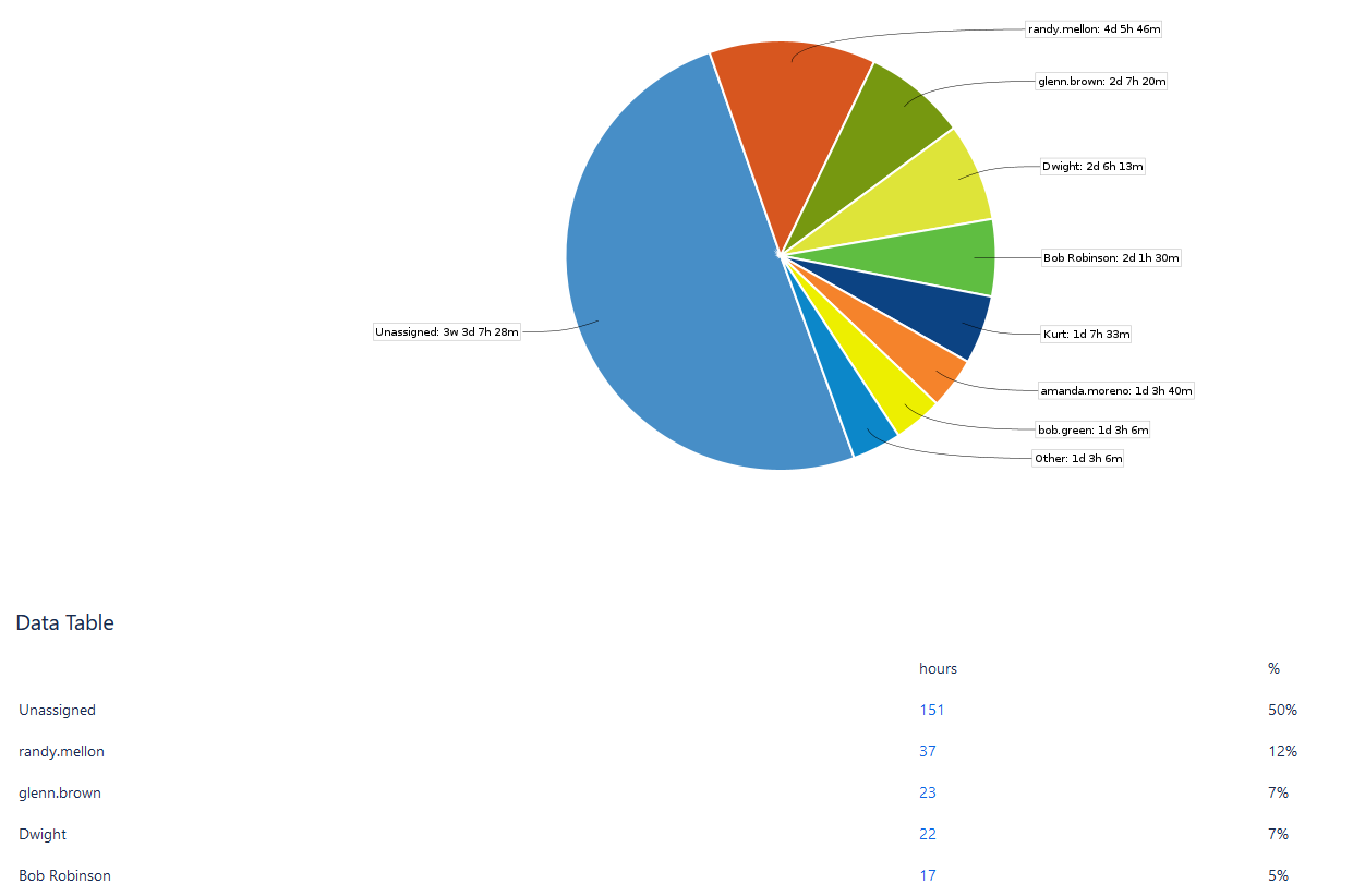
There are plenty of reports to choose from. Here you may see a Workload pie chart illustrating the various aspects connected to a project or filter. It provides the flexibility to decide whether to present information based on the team's present estimation, the initial estimate, or the actual time invested.
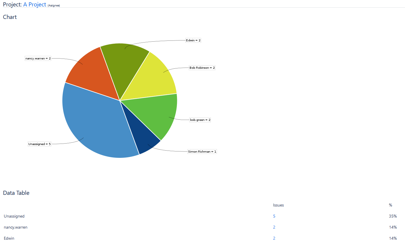
Or a Pie Chart Report, that offers insights into the issues found in a project or filter, based on a selected criterion. This functionality grants a swift overview of the distribution of issues within the dataset, thereby improving clarity and comprehension.
Pie Chart Gadget in Jira Dashboard
Also, you can find a plethora of charts for the Jira Dashboard. You can create a new dashboard or add charts to the existing ones by simply editing them. For example, users can add a Workload Pie Chart Gadget:
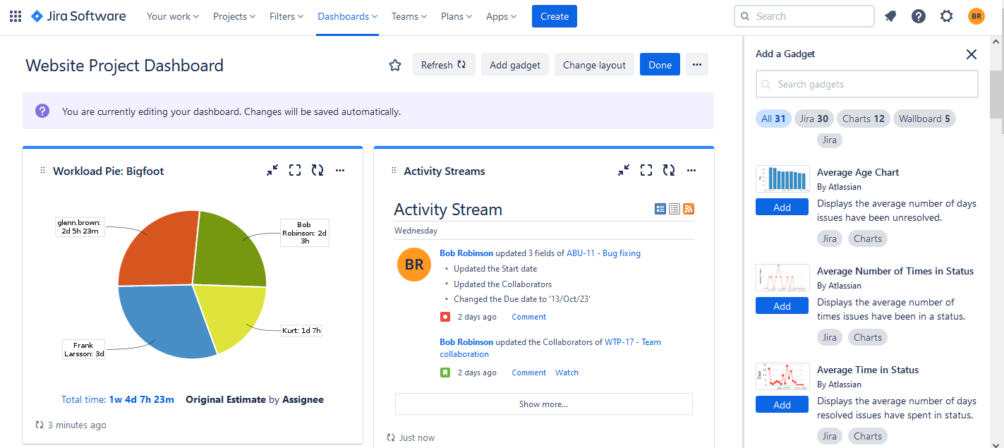
The pie chart gadget is one of the most popular gadgets for the Jira Dashboards.
Use Charting Plugin
Another way is to use add-ons that provide more advanced custom charts for better visualization and tracking. For example, you may try ActivityTimeline, a resource management and tracking tool, that offers plenty of reports and charts for the user's convenience. It's available for the Jira Data Center and Jira Cloud.
Custom Charts with ActivityTimeline
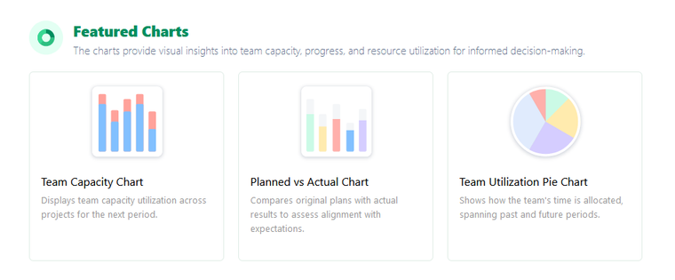
There are three main charts in ActivityTimeline to display the data: Team Capacity Chart, Planned vs Actual Chart, and Team Utilization Pie Chart which we'll discuss more.
Team utilization is a critical metric in project management. It measures how effectively the resources are used, and this data is invaluable for optimizing resource planning and maximizing efficiency.
Understand Team Utilization with Pie Chart
The Team Utilization Pie Chart is a visual aid crafted to offer a holistic perspective on the allocation of a team's time across different projects. Featuring the capability to display data for both historical and future periods, this chart aids managers and teams in reviewing past resource allocations and planning for forthcoming tasks efficiently.
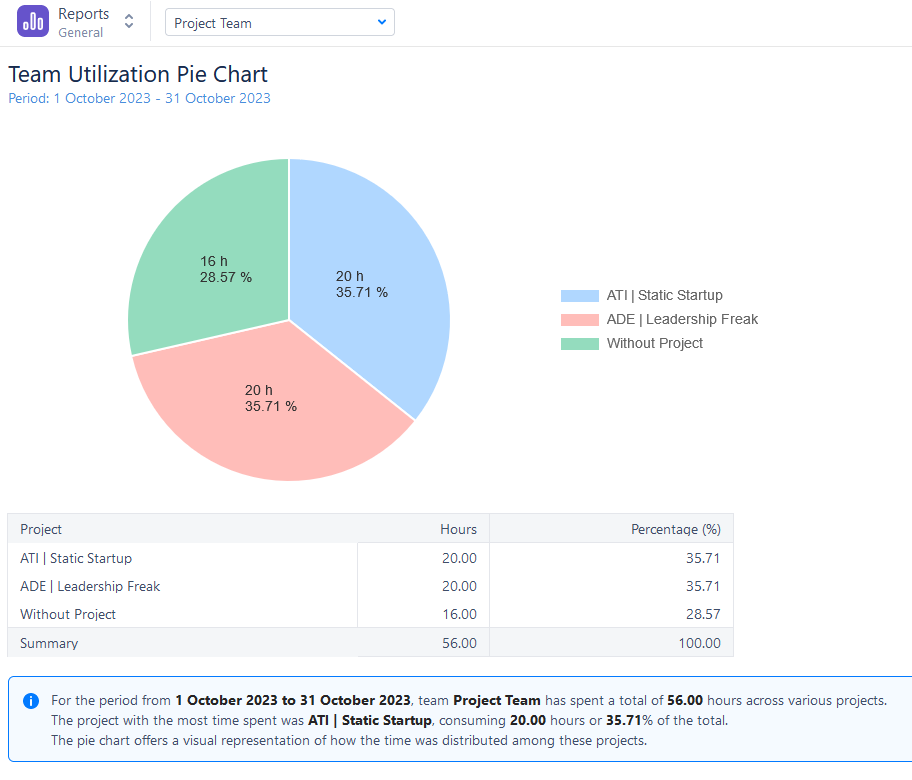
Critical Elements of the Chart The chart comprises two primary components:
- Historical Time Allocation: This section provides a breakdown of how the team's time was apportioned among various projects during a completed timeframe.
- Future Time Allocation: This segment offers a forecast of how the team's time is expected to be distributed in an upcoming timeframe.
Different sections of the pie represent different projects where resources are allocated. This chart shows resource distribution for various projects, allowing you to see where your teams will spend their time the most.
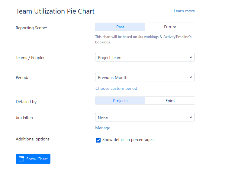
The chart's configuration & generation process is simple and quick. Choose the reporting scope - whether to use worklogs (past) or estimates (future) for analysis. Choose a team, a single user, or all of the resources, and set the needed period. You can also add a Jira Filter.
This type of chart is very useful, as with its regular updates the chart ensures accuracy. Also, you can use it in conjunction with other reports for a comprehensive view and share the insights with your team to drive improvements.
Conclusion
Data visualization plays a crucial role in making informed decisions. The ability to understand and optimize your team's utilization is a game-changer. Jira charts empower you to make data-driven decisions and enhance your team's performance.
The Team Utilization Pie Chart is a valuable tool for project managers, providing insights into team performance, workload distribution, and project prioritization. By harnessing the power of this chart, you can enhance your team's efficiency and achieve project success.