
{{tl-dr}}
If you lead a sizable team, you already know the conversation:
“Can your team take this on?”
“Why is that initiative slipping… again?”
“Do we actually need another hire?”
Most leaders answer with some combination of instinct, experience, and a half-trustworthy spreadsheet. It works—until it doesn’t. And when it doesn’t, the fallout is painfully predictable: blown deadlines, opaque workloads, frustrated teams, and budget fights that feel like courtroom drama.
The problem isn’t leadership. It’s the lack of evidence. Capacity planning without metrics is guesswork dressed up as governance.
This guide breaks down the 10 KPIs every PMO leader, department head, and senior project manager must track to move from intuition to operational clarity. And because KPIs don’t matter if they’re not measurable, you’ll see exactly how to track each one inside Jira using ActivityTimeline (AT) as your single source of truth.
Why Gut-Based Capacity Planning Breaks
In fast-moving orgs, instinct is fast. But instinct doesn’t scale, and it definitely can’t defend a headcount request to finance. Capacity KPIs, on the other hand, do three things gut feel never will:
- They prove whether your team is actually overloaded or just noisy.
- They show patterns, not anecdotes.
- They turn planning from blame management into governance.
With the right KPIs, suddenly headcount conversations sound like this:
“We’re running at 87% utilization across critical roles for three consecutive quarters. Skill-based capacity is short by 1.7 FTEs. Here’s the forecast.”
ActivityTimeline plugs into Jira and does the one thing Jira isn’t built to do out of the box: turn scattered estimates, worklogs, calendars, and story points into normalized, trustworthy, decision-grade metrics.
Call it the evolution from “We feel busy” to “We’re 83% utilized this sprint, and here’s why.”
Now to the KPIs.
The 10 Capacity Planning KPIs That Actually Matter
Below are the KPIs that high-functioning PMOs consistently rely on. If you’re tracking these, you’re operating at a level most teams never reach.
1. Resource Utilization Rate (%)
Think of this as the temperature of your team’s workload. It’s the share of a person’s available hours that are actually booked for meaningful work — not calendar noise, not “maybe” tasks. Utilization separates “we feel busy” from “we’re actually at risk of burning out.” Too low and you’re wasting payroll; too high and you’re borrowing time from tomorrow’s roadmap.
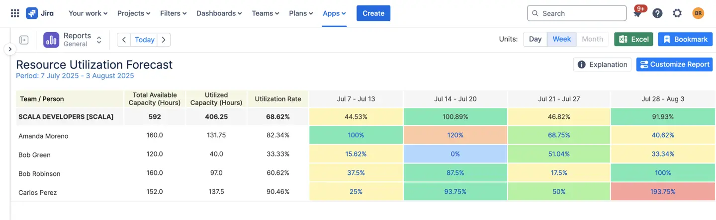
Open ActivityTimeline’s Resource Utilization Forecast Report and select the timeframe you want to analyze — anything from a single sprint to a multi-quarter roadmap. AT automatically merges Jira estimates, logged hours, and non-working events to calculate what percentage of each person’s available capacity is already booked. You can switch between hour-based and percentage views, drill down to individual days, and quickly spot emerging overload zones before they escalate.
2. Team Capacity (Total Available Hours)
This is your real denominator: total productive hours after you subtract holidays, vacations, training, and other non-working time. Percentages lie when the baseline is wrong. Accurate capacity = accurate forecasts.
Start with AT’s Team Capacity Chart, which aggregates every relevant calendar input: user work schedules, regional holidays, vacations, training days, and custom non-working events. AT pulls all of this directly from Jira and your configured holiday schemes, giving you a precise hour count for each team.
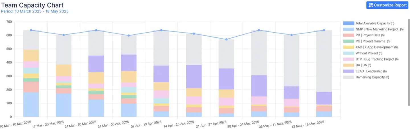
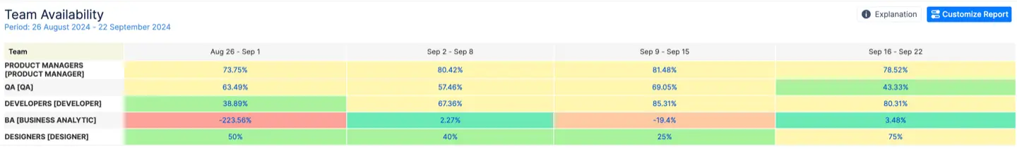
Cross-check it with the Team Availability Report, which shows exactly how many productive hours remain in any upcoming period — your baseline for every capacity calculation that follows.
3. Planned vs. Actual Time (Estimate Accuracy)
The KPI that tells you how realistic your planning actually is. It measures the gap between what you thought work would take and what it did take. Persistent underestimates create a culture of missed commits and surprise neck-deep sprints. Good estimate hygiene is the difference between predictable delivery and perpetual crisis management.
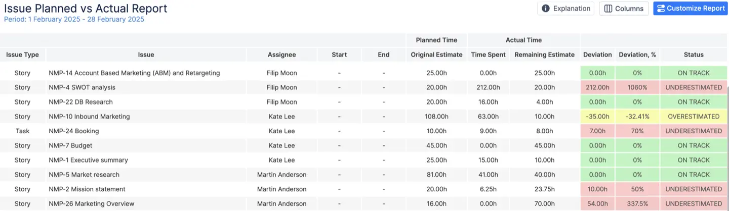
Run the Planned vs. Actual Report in AT. The system takes the original estimates from Jira — including converted story points if you prefer point-based planning — and compares them with real worklogs. You’ll see variance percentages at every granularity: task, epic, project, or entire team. The report highlights where teams consistently underestimate (or overestimate), helping you recalibrate estimates and improve forecast reliability across future sprints.
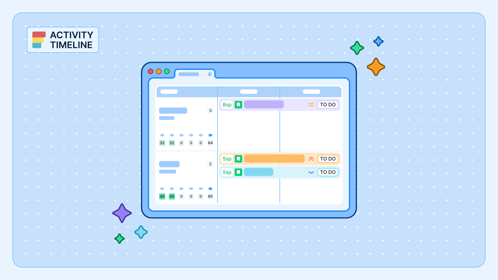
4. Workload Distribution (Heatmap)
A visual snapshot of who’s overloaded, who’s doing fine, and who’s idle — rendered as a heatmap instead of a dozen emails. Imbalance is surgical; fix it early and you prevent slip, burnout, and morale rot.
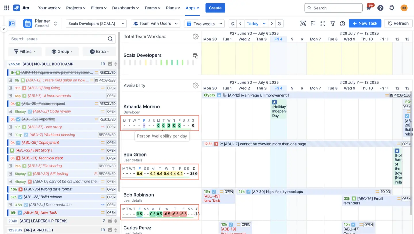
Open the Planner dashboard and turn on the Workload Indicator. AT visualizes workload as a heatmap: green means healthy allocation, yellow signals rising pressure, and red means overload. You can view distribution by day, week, or custom ranges. Hover over any cell to see the exact hours planned for that user, then drag-and-drop assignments directly from the heatmap to rebalance the load in real time. You can also switch to displaying availability of each user to decide who can take more tasks without being overwhelmed.
5. Billable vs. Non-Billable Ratio
Where is your time actually monetized? This splits client-facing, billable work from internal or overhead tasks. For service orgs, this ratio drives revenue models, margins, and resource-pricing decisions. If billable time drifts, your unit economics do too.
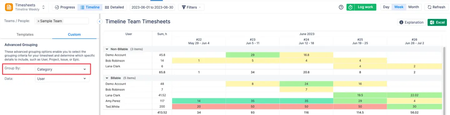
First configure Worklog Categories inside AT (e.g., Billable, Non-Billable, R&D, Support). Once categories are set, open Detailed Timesheets or Timeline Timesheets, apply category filters, and AT instantly calculates ratios for individuals, teams, or entire portfolios. This lets you track utilization trends over time and validate billable targets against actual performance.
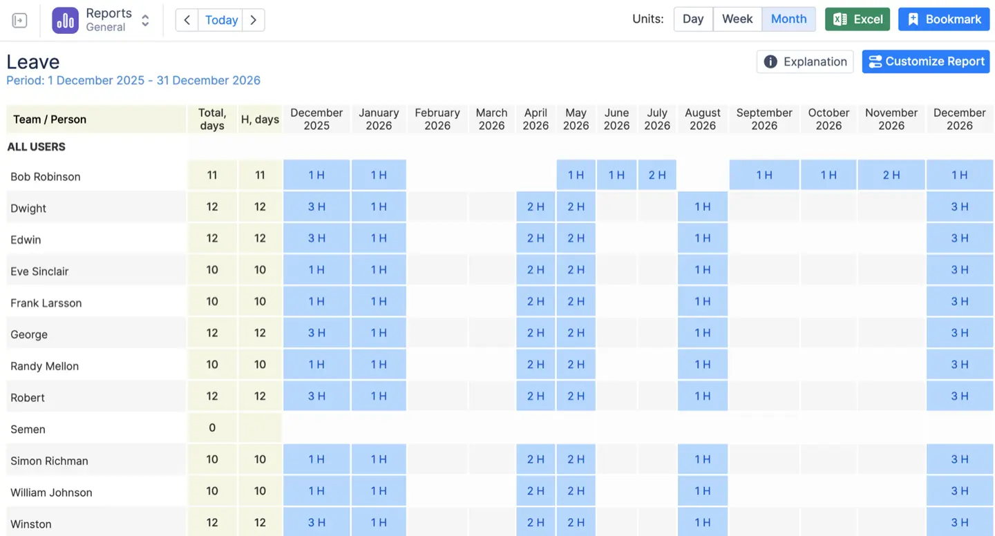
6. Time Lost to Non-Project Events
All the invisible drain — vacations, sick days, training, public holidays — that quietly rewrites your capacity. Forecasts that ignore this are optimistic fiction. Planning that accounts for it is defensible.
Go to the Leave Report in ActivityTimeline. It aggregates every minute of time off — PTO, sick leave, public holidays, onboarding, training, and internal meetings if categorized as non-project. The report quantifies total lost hours and shows how they impact team capacity for the selected timeframe. This adjusted capacity automatically flows into all other AT reports, ensuring that your capacity planning reflects reality instead of wishful thinking.
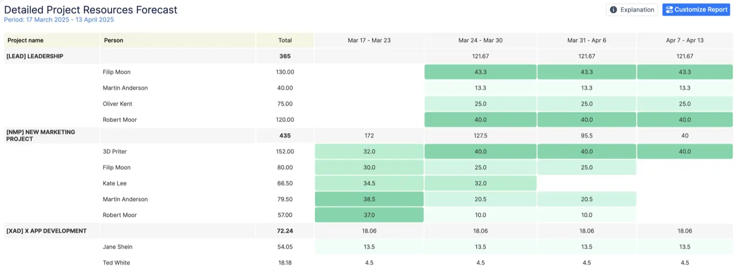
7. Resource Allocation by Project
Which projects are consuming your team’s oxygen? This KPI shows the allocation of hours across active work. It exposes concentration risk (one project eating the engine) and helps you rebalance priorities before a stakeholder meeting turns into triage.
Open the Project Resources Report to see how every hour of your team’s time is allocated across active projects. AT displays allocation as totals, percentages, or visual charts. For a high-level snapshot, switch to the Utilization Pie Chart, which reveals which projects dominate the team’s bandwidth. Filters allow you to slice by team, role, or time period — perfect for cross-checking whether actual allocation matches strategic priorities.
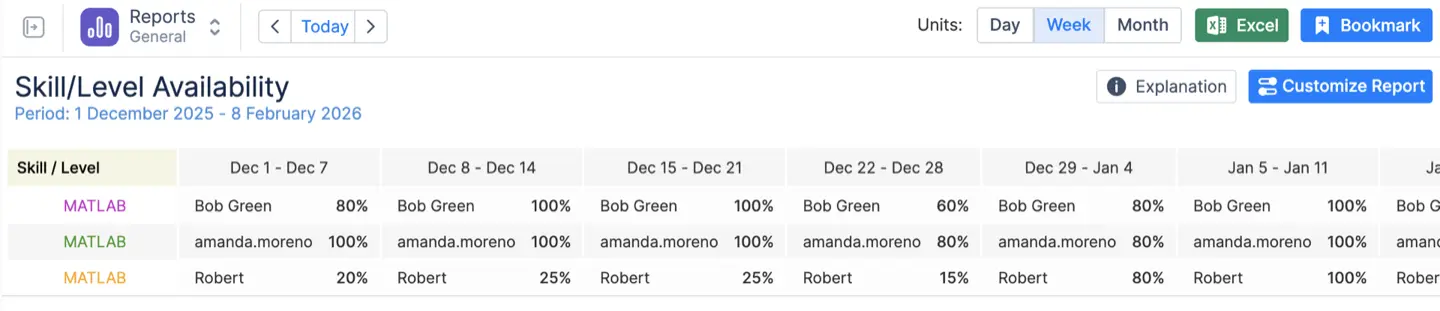
8. Skill/Role Capacity vs. Demand
Not all headcount is equal. This measures available hours for a specific skill (e.g., Senior Backend) against incoming demand for that skill.
Hiring “developers” doesn’t fix a senior backend shortage. Skill-aware capacity avoids bad hires and firefighting.
Assign skills, levels, and roles to team members in AT’s user settings (e.g., “Senior Backend,” “Product Designer,” “QA Automation”). Then open the Skill/Level Availability Report. AT aggregates all incoming work that requires those skills and compares it with available hours for each skill group. The result is a clear view of shortfalls, upcoming constraints, and where you might need to hire, train, or redistribute work before bottlenecks appear.
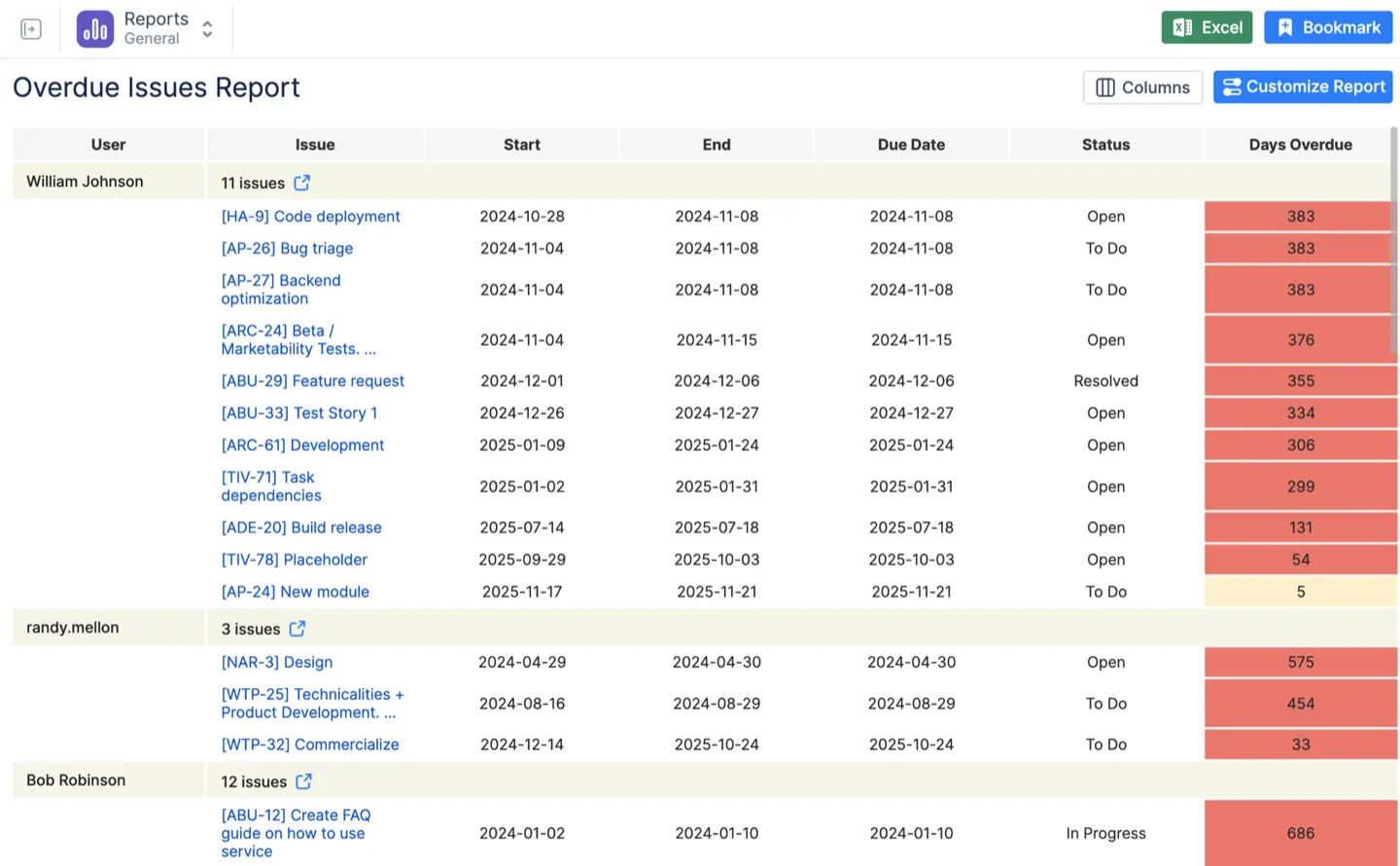
9. Schedule Slippage (Overdue Tasks)
This captures tasks that should be done but aren’t — and the hours trapped behind missed dates.
Slippage shows you where capacity is already failing. It’s the canary in the coal mine for dependencies, misestimates, or blockers.
Navigate to AT’s Overdue Issues Report. It pulls every task whose due date has passed and calculates the total overdue effort. You can filter by project, team, assignee, or priority, allowing you to pinpoint the root cause of slippage. This gives you a clear picture of capacity breakdowns and helps you prioritize triage: unblocking dependencies, tightening estimates, or rebalancing workload.
10. Sprint Progress (Logged vs. Remaining Hours)
A sprint’s health check measured in time, not just story points. This compares committed hours to what’s actually been logged. Time-based progress uncovers delivery risk earlier than point-based views, especially when work crosses silos.
Open the Progress Timesheets inside ActivityTimeline. AT compares committed hours for the sprint with the hours logged so far, dynamically updating remaining capacity. You’ll see how much work is ahead or behind pace in real time. This allows you to intervene early—reassign tasks, renegotiate scope, or adjust priorities before the sprint drifts too far off target.
How to Turn KPIs into an Operating Model (Not Just Pretty Dashboards)
1. Standardize your Jira fields
Start/Due dates, story points, original estimates, remaining estimates, worklog categories — make them consistent. AT will do the rest.
2. Set a reporting cadence
Weekly for utilization, monthly for capacity, sprint-level for delivery control.
3. Build role-specific dashboards
Executives don’t need the same views as engineering managers. AT lets you save dashboards by persona.
4. Combine KPIs for decisions
Utilization + estimate accuracy + skills capacity = bulletproof hiring and allocation logic.
5. Protect your data
Use AT’s timesheet approvals and Webhook sync to maintain auditable, finance-ready reporting.
Why Mid-Size and Large Teams Choose ActivityTimeline
You don’t need another visualization layer — you need a source of truth. AT provides:
- A consolidated dataset from Jira
- Reports built specifically for PMOs and capacity governance
- Skill, team, and holiday modeling
- Worklog categories, approvals, and integrity controls
- Adaptability across story points, hours, and mixed methods
This is what Jira becomes when you treat it like an operations platform instead of a ticket system.
From Intuition to Evidence
Capacity planning isn’t magic, and it’s definitely not a vibe. It’s a system.
With the right KPIs — and a tool designed to surface them — you get to replace assumptions with proof, defend decisions with data, and forecast without apology.
You now have the 10 metrics that make that possible.
{{rich-cta-3}}