
2026 requires a new approach to leading teams. Project managers need more than the default dashboard and "Issue Statistics" to succeed. When you manage multiple projects, you require a Jira dashboard for project management to see team performance and workload clearly. This is why many teams look beyond standard Jira reports to find integrated solutions.
Many leaders use "Single Pane of Glass" management to put data and team capacity into one view. Using a project dashboard helps you see problems early and allows quick, data-driven decisions.
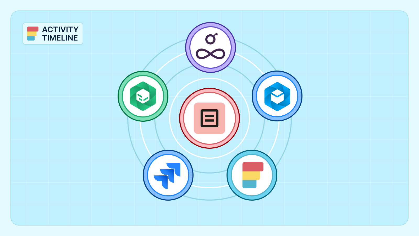
Many teams search how in Jira create a dashboard for a project. We will look at five apps from the Atlassian Marketplace that turn Jira into a powerful reporting engine.
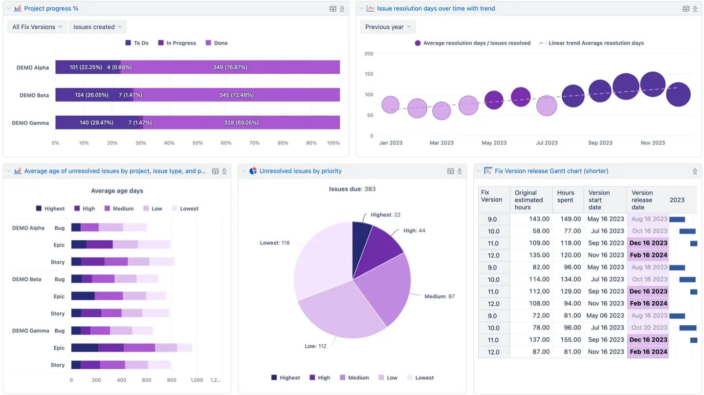
ActivityTimeline Project Reporting Gadgets
ActivityTimeline improves the experience of custom dashboards. It connects advanced resource planning with the tools you already use. Standard Jira gadgets show only basic details, but ActivityTimeline adds real-time insights into team performance and workload. You can see all your project related information in one workspace.
These gadgets focus on how to track projects. You can track work at the Jira project, Epic, or Initiative level. The system acts as a Jira project status dashboard by using estimated time and real-time data to measure success. It compares your estimates with logged time. This helps PMs monitor project health accurately. You can quickly see if an Epic is on track or underestimated. The gadgets refresh automatically to show the latest data. This makes it easy to get helpful insights and stay organized.
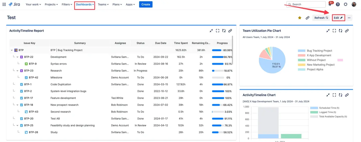
ActivityTimeline lets you add advanced reports to your Jira dashboard. This creates a central hub for your project team. To start, one of multiple dashboards and click "Edit." Search for the ActivityTimeline gadget and add it.
These gadgets show real-time insights and refresh automatically. You can also embed these visuals into Confluence to help with collaboration.
The "Big Three" gadgets
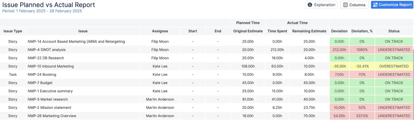
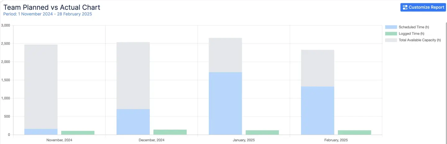
Planned vs. Actual Report: This tool measures the accuracy of your estimates. It compares planned time with actual logged hours. It uses color-coded statuses to show project health. For example, red means a task was underestimated.
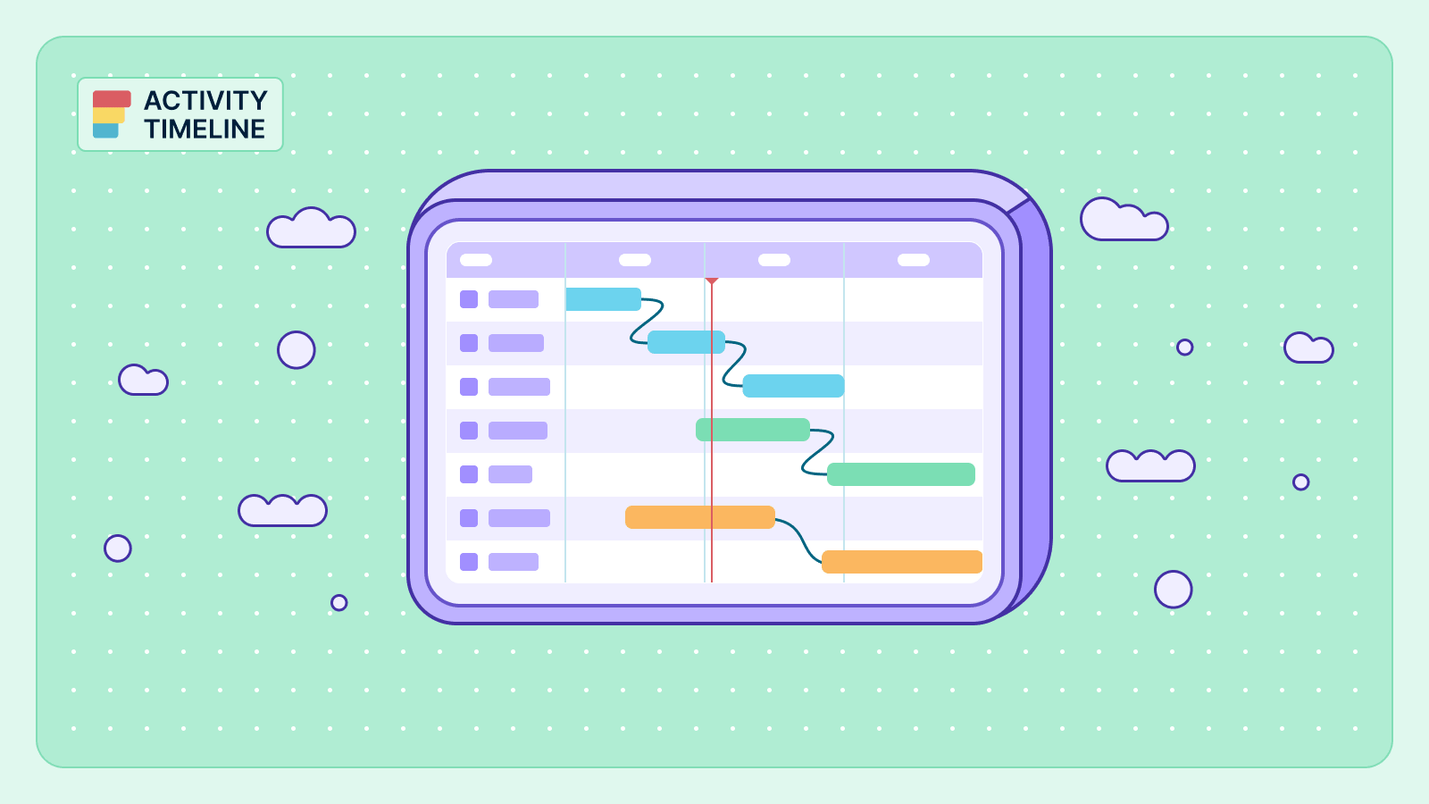
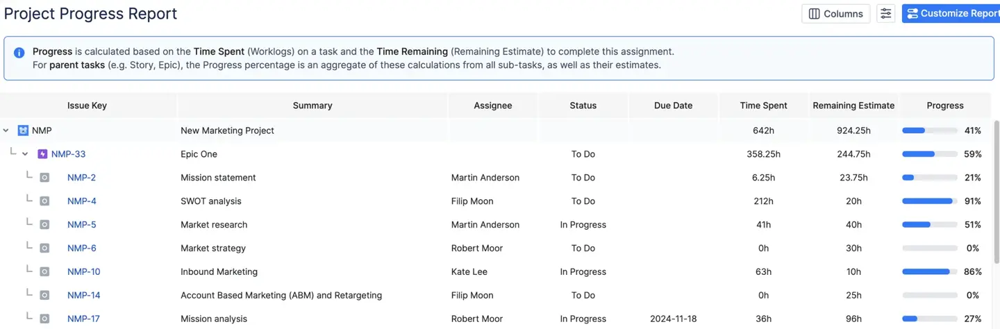
Project Progress Report: This report is a high-level health check. It uses a tree structure to show how child tasks affect parent Epics. You can calculate progress by the total number of tasks or by time estimates.
Planned vs. Actual Chart: This chart offers a visual trend analysis. It compares team capacity, scheduled work, and actual output. It helps project managers identify trends and see if the team is meeting goals over time.
Top Solutions for Integrated Jira Project Dashboard
ActivityTimeline — Best for Resource & Capacity-Driven Dashboards
ActivityTimeline is a resource planning tool that combines Jira delivery data with human capacity and time insights. It helps project managers turn a standard Jira instance into a system dashboard for their teams.
Best For
This tool is best for resource leads and project managers in large enterprises or growing agencies.
Medtronic replaced complex Excel tracking with a centralized system to manage thousands of tasks/users. Managers now see an overview of team performance and use it to monitor upcoming deadlines and resource availability from one place.
Dashboard Capabilities
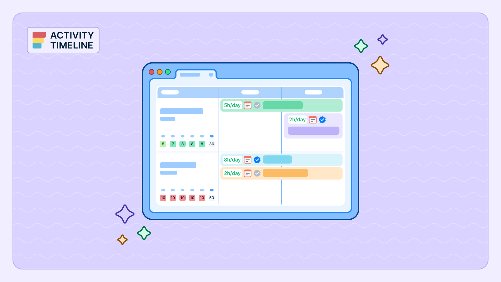
You can implement advanced resource reports, charts, and timesheets directly as Jira dashboard gadgets. These gadgets provide a view of project progress and team performance in real time. Unlike native Jira tools, it has color-coded workload indicators (red if a person is overbooked, yellow - underloaded, green - balanced).
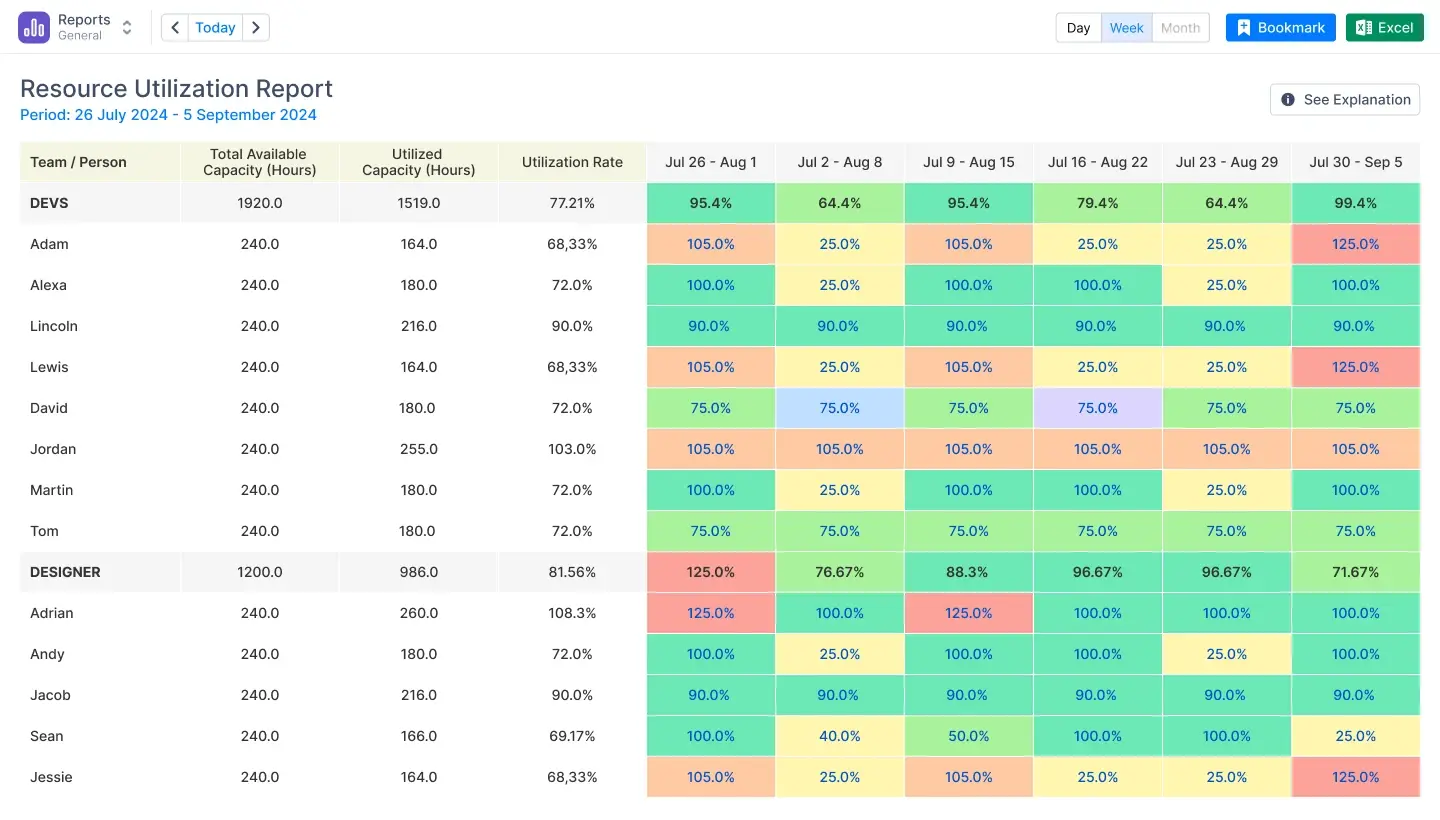
To guarantee you always view the most recent data, the devices support data caching and automatic refresh. On a single dashboard, you can track projects at the Epic or Initiative level. It also adds non-Jira events to your project health metrics, such as holidays, sick days, and vacations. This ensures that your planning is always realistic and accurate.
What It Does Best
- Converts advanced resource reports into native Jira gadgets.
- Managers never have to leave the Jira dashboard to see utilization.
- Offers complete visibility across specific projects in a single view.
Limitations
- Prioritizes human timelines over Gantt charts based on tasks.
- Large data sets take longer to load without filters.
- Some gadgets offer limited customization for specific data fields.
Tempo — Best for Timesheets & Cost Tracking
Tempo is a Jira time-tracking app with a heavy focus on financial reporting, billing, and accounting. It helps organizations manage performance metrics to measure relevant metrics with high precision.
Best For
This solution is ideal for organizations driven by compliance, strict client invoicing, and detailed cost center tracking.
Dashboard Capabilities
Tempo offers various Jira dashboard gadgets that translate logged hours into financial insights. These devices let project managers use thorough time reports to monitor project performance and financial situation. Custom account labels let you classify time to view Jira data across several teams or clients. The dashboard provides a high-level overview of work done, which helps Jira administrators to review and approve timesheets in bulk.
There is an integration for ActivityTimeline users. Watch this video to see how it works:
Key Advantages
- Excellent for financial reporting and client billing.
- Precise tracking of CAPEX, OPEX.
- Integrates with Jira and ActivityTimeline.
- Offers multiple gadgets for high-level management overviews.
Key Disadvantages
- Less emphasis on future capacity planning.
- Lacks "what-if" scenario planning.
- Requires purchasing separate modules for full functionality.
- The system can experience lags with large reports.
eazyBI — Best for Advanced BI & Custom Metrics
EazyBI is a business intelligence tool that provides deep data mining and complex analytical reporting for Jira. It allows teams to transform raw Jira data into multidimensional cubes for thorough analysis.
Best For
This platform is ideal for data-heavy organizations that have dedicated analysts. It is perfect for project teams needing highly specific key performance indicators that multiple tools cannot provide.
Dashboard Features
A drag-and-drop interface lets you create sophisticated reports and add them as Jira dashboard tools.
The tool supports many visuals; including pie charts, timeline views, and interactive charts. It enables you to combine Jira data with external sources like SQL or Google Sheets. This creates a simple project dashboard for different projects. Project managers can start with a high level overview and then move to more detailed insights. It also provides historical reports to identify trends in team performance. This helps users visualize data across the entire Jira instance to make data driven decisions.
Core Strength
- Powerful data mining and multidimensional analysis.
- Large library of different charts and custom visualizations.
- Combines Jira info with diverse external data sources.
- Tracks historical trends and project snapshots.
Trade-Offs
- High learning curve, requires MDX knowledge for custom charts.
- Lacks simplicity for quick, out-of-the-box track progress checks.
- Initial setup of data models requires significant effort.
Structure — Best for Portfolio & Hierarchy Views
Structure is a project portfolio management tool that organizes Jira issues into multi-level hierarchies. It helps project managers see how particular sub-tasks, narratives, and epics fit projects.
Best For
This tool is ideal for project teams organizing "messy" backlogs or large-scale portfolios with complex dependencies.
Dashboard Capabilities
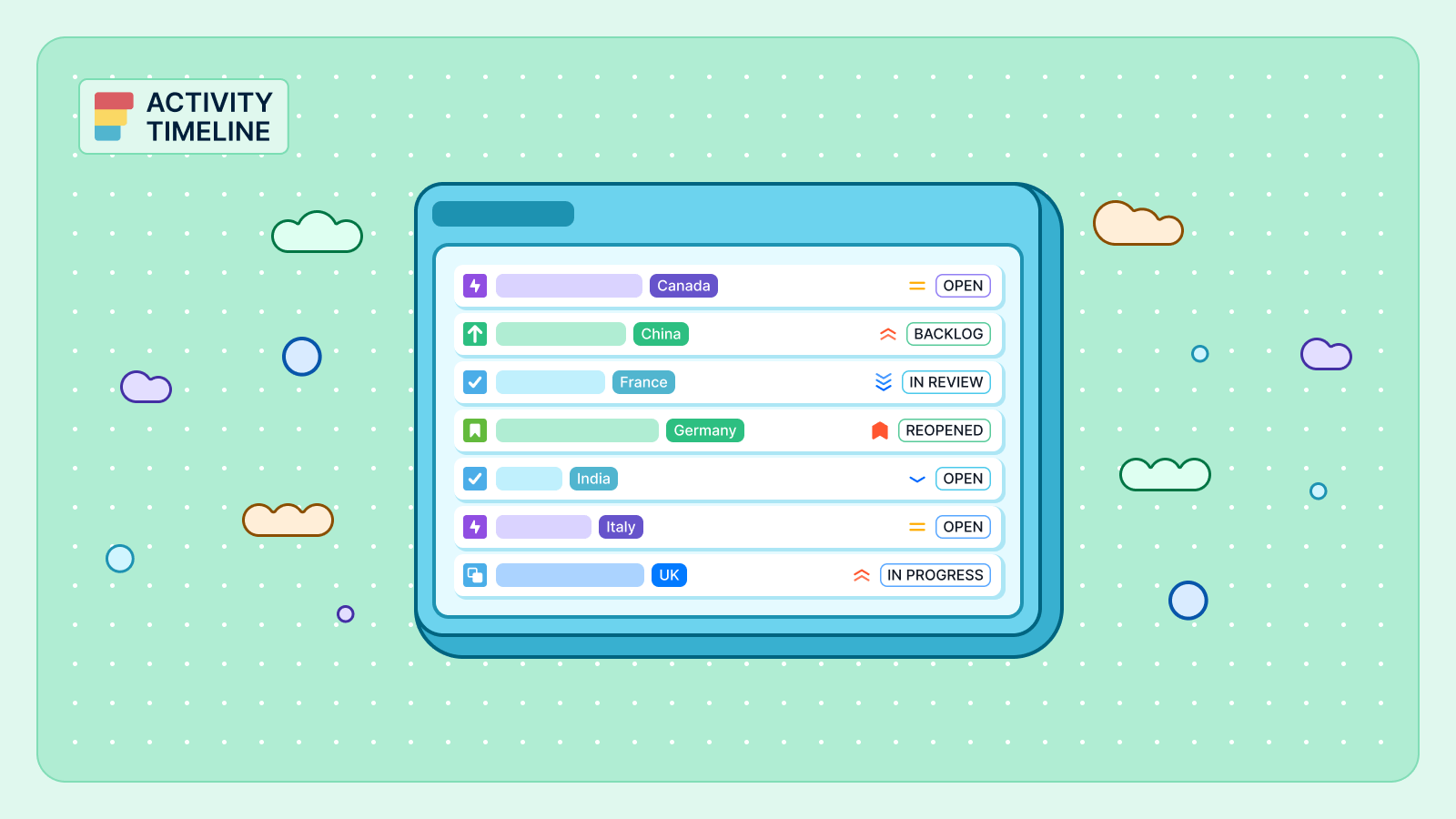
Structure transforms your Jira instance by replacing lists with spreadsheet-like tables that can be embedded as Jira dashboard gadgets. These gadgets allow you to track progress across multiple projects by organizing data. You can use custom formulas to calculate key metrics, like summing up time estimates or costs across hierarchy. The dashboard view lets users directly update Jira issues straight from the structure using inline editing. By giving an overview of all current projects, it also points up potential problems and early scheduling conflicts. If you need a more visual timeline, it integrates with Gantt chart extensions to show project roadmaps directly on your dashboard screen.
Strengths
- Visualizes massive, multi-level hierarchies (Epic > Story > Sub-task).
- Organizes scattered tasks into clear structures.
- Aggregates and reports on project data using custom formulas.
- Provides real-time synchronization between the structure and Jira tickets.
Weaknesses
- Limited native time and capacity analytics.
- Best used together with other reporting apps.
- Users unfamiliar with hierarchical data modeling have a steeper learning curve.
BigPicture — Best for Roadmaps & Gantt Charts
BigPicture is a project and portfolio management (PPM) tool that connects high-level planning with execution data. It gives you a unique point view of everything happening within your Jira instance.
Best For
This app is ideal for Program Managers overseeing multi-year roadmaps. It works well for organizations using Waterfall, Agile (SAFe), or Hybrid methodologies.
Dashboard Capabilities
BigPicture provides several gadgets for your Jira dashboard to monitor project health. The risk matrix gadget allows you to assess threats across multiple projects through a heat map. You can also add report gadgets to track metrics like velocity and plan delays. The tool segments Jira data into "boxes." This allows one to arrange tasks either monthly or quarterly. Directly on your dashboard, you could see data using a Gantt-style timeline or a hierarchical tree. These views show time spent compared with original estimates. For resource management, the tool offers color-coded indicators to see if project teams are over or under-allocated in real time.
Benefits
- Gantt visualizations and long-term portfolio planning.
- Full compliance with SAFe requirements.
- Managing complex dependencies between tasks and teams.
- Creating "what-if" scenarios for roadmaps.
Drawbacks
- Configuration is complex and takes time to set up.
- Heavy interface that can be overkill for small agile teams.
- Learning materials are sometimes unclear for new users.
Technical Deep Dive and Best Practices
Building a dashboard is only the first step. Proper configuration ensures accurate, actionable insights and helps you track project metrics effectively.
Configuring Your Gadgets
A successful Jira project management dashboard requires precise settings to be effective. Setting periods to days or weeks helps teams understand their workload. Filters are also necessary to remove unrelated tasks. This helps managers track progress without irrelevant data.
In ActivityTimeline, to navigate through the timelines you can change time units to days or months and apply custom filters.
Ensuring Data Integrity
Data integrity means having one reliable version for your team. Reports lose value if users can delete or change relevant information like project names or dates after work is finished. Lock core fields to prevent edits after work is done, ensuring accurate payroll, invoicing, and trust.
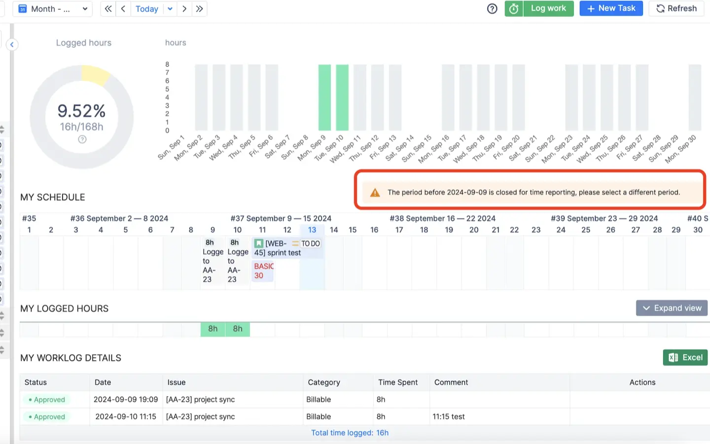
ActivityTimeline’s approval process fully locks timesheet data.
Managing Independent Estimates
Managing story points and hours is a best practice for modern agile teams. Points measure the complexity of a task, while hours measure the time needed to finish it. Combining these gives a visually appealing view of team performance and future capacity. It prevents planning errors during sprints.
ActivityTimeline allows you to turn story points into hours. You can apply this globally or for a project.

Portability for Stakeholders
Portability is essential for maintaining transparency through shared dashboards. Many leaders need to see project health but don't have time to navigate Jira. Embed live charts into Confluence so stakeholders can view the Jira project status dashboard without Jira access. This makes it the most effective Jira dashboard for project management.
You can click a "link icon" on any ActivityTimeline gadget to embed it into a Confluence page.
Conclusion
A structured Jira project management dashboard improves clarity across teams. Apps like ActivityTimeline provide you with a full picture, yet native Jira tools only monitor basic tasks. Help your team to be productive and achieve their goals by properly configuring your devices and keeping up accurate data.